Infographic on Anthropogenic Methane Emissions

This blog post explains the process of creating an infographic on anthropogenic methane emissions in 2021, with a particular focus on the data visualization considerations and choices made.
Data Visualization
R
Author
Affiliation
Published

March 12, 2024

Completed infographic (where we are heading!)

Infographic on anthropogenic methane emissions in 2021

Purpose

In my infographic, the overarching question that I will be answering is where anthropogenic methane emissions came from in 2021. This includes the countries where emissions are occurring most frequently and also the human activities (e.g., energy production, agriculture, etc.) that contribute the most to these emissions.

Data

The data set that I will use comes from the International Energy Agency (IEA), a Paris-based intergovernmental organization with 31 member countries and 13 association countries. The group was created following the 1973 oil crisis by the Organisation for Economic Co-operation and Development (OECD) to oversee and collect data on global energy markets. In the last decade, the group has increasingly played an important role in guiding and advocating for an accelerated global energy transition away from fossil fuels (International Energy Agency (IEA) 2024).

Since 2020, the IEA has published yearly data estimating global methane emissions at a country-level. For methane emissions resulting from oil and gas processes (upstream and downstream), these figures are calculated using a combination of measurement data (mostly from satellite readings) and activity data on the specific actions being taken that release vented, fugitive, or incomplete-flare emissions. Coal mine methane emissions are estimated primarily by looking at the ash content of coal produced in different countries, mine depth, and regulatory oversight. Furthermore, estimating country-level emissions from agriculture and waste mainly relies only satellite technology. Lastly, other methane sources are estimated using manufacturing data and the emissions factors associated with the industrial processes carried out in that country (International Energy Agency (IEA) 2022b).

I will be using the 2022 data set, which provides emissions estimates for the year 2021 (International Energy Agency (IEA) 2022a). Anyone can access this data set for free after making an account on the IEA website.

In addition to the methane data set, I also want data on 2021 population values of different countries for computing emissions per capita, so I downloaded a free data set from the World Bank website, which did not require me to have any sort of account (The World Bank, n.d.).

Setup & data import

Code
##~~~~~~~~~~~~~~~~~~~~~~~~~~~~~~~~~~~~~~~~~~~~~~~~~~~~~~~~~~~~~~~~~~~~~~~~~~~~~~
##                                setup                                     ----
##~~~~~~~~~~~~~~~~~~~~~~~~~~~~~~~~~~~~~~~~~~~~~~~~~~~~~~~~~~~~~~~~~~~~~~~~~~~~~~

# load packages
library(here)
library(tidyverse)
library(ggtext)
library(treemapify)
library(showtext)

# import fonts
font_add_google(name = "Merriweather Sans", family = "merri sans")
font_add_google(name = "Barlow Condensed", regular.wt = 200, family = "barlow")

# enable {showtext} for rendering
showtext_auto()

# set scipen option to a high value to avoid scientific notation
options(scipen = 999)
Code
##~~~~~~~~~~~~~~~~~~~~~~~~~~~~~~~~~~~~~~~~~~~~~~~~~~~~~~~~~~~~~~~~~~~~~~~~~~~~~~
##                                import data                               ----
##~~~~~~~~~~~~~~~~~~~~~~~~~~~~~~~~~~~~~~~~~~~~~~~~~~~~~~~~~~~~~~~~~~~~~~~~~~~~~~

# read in methane data
methane_df <- readr::read_csv(here("data", "2024-3-12-post-data", "IEA-MethaneEmissionsComparison-World.csv")) %>% 
  janitor::clean_names() %>% # convert column names to lower_case_snake format
  select('country', 'emissions', 'type') # select relevant columns

# read in population data
pop_df <- readr::read_csv(here("data", "2024-3-12-post-data", "worldbank_pop.csv")) %>% 
  janitor::clean_names() %>%
  rename('population' = 'x2021', # rename column with 2022 populations to 'population'
         'country' = 'country_name') %>% # rename columns with countries (for joining)
  select('country', 'population') # select these two columns

General data wrangling

To start, I have some general data wrangling steps that allowed me to explore the data and calculate some of the statistics that I ended up including in my infographic. In the code chunk below, I’m storing the world-level rows in the IEA data set as their own data frame, and reconfiguring the data frame to find the percent of total global emissions coming from each of the four sectors, which I ended up including in the legend of my first plot.

Code
# store observations regarding entire world as its own df
world_df <- methane_df %>%
  filter(is.na(country)) %>% 
  group_by(country, type) %>% # group by input variables ('type' must be last to combine observations in next line)
  summarize(total_emissions = sum(emissions, na.rm = TRUE)) %>% # create summary df that combines observations with same 'type'
  ungroup() %>% 
  pivot_wider(names_from = type, values_from = total_emissions) %>% # create new columns named based on 'type' and containing values from 'total_emissions'
  janitor::clean_names() %>%
  mutate(total_emissions = agriculture + energy + waste + other) %>% # re-create 'total_emissions' column
  select(-country)

# calculate percents of 'total_emissions' coming from each type of emissions (to be put in legend of treemap)
world_df$agriculture / world_df$total_emissions
[1] 0.2902036
Code
world_df$energy / world_df$total_emissions
[1] 0.545233
Code
world_df$waste / world_df$total_emissions
[1] 0.1446558
Code
world_df$other / world_df$total_emissions
[1] 0.01990765

I also perform some general data wrangling on my methane data frame, which will be important moving forward. After removing the world-level rows that I subsetted in the previous code chunk, I’m doing a ‘group_by’ command followed by a ‘summarize’ command to combine observations that are of the same type. Before doing this, there were multiple observations for energy emissions, breaking down into further levels of granularity based on other columns that are not selected here. I’m also combining all countries that are part of the European Union by changing their country names to the same string and then again using the ‘group_by’ and ‘summarize’ commands to combine rows. Lastley, I decided to make a wide form of this same data frame, which will be helpful when we get to plot 2 of my infographic.

Code
methane_df <- methane_df %>%
  filter(!(is.na(country))) %>% # remove observations regarding entire world
  group_by(country, type) %>% # group by input variables ('type' must be last to combine observations in next line)
  summarize(total_emissions = sum(emissions, na.rm = TRUE)) %>% # create summary df that combines observations with same 'type'
  ungroup() %>% 
  mutate(country = case_when(country == "Other EU17 countries" ~ "EU*", # reassign country names for countries in EU so we can combine these observations
                             country == "Other EU7 countries" ~ "EU*",
                             country == "France" ~ "EU*",
                             country == "Italy" ~ "EU*",
                             country == "Germany" ~ "EU*",
                             country == "Sweden" ~ "EU*",
                             country == "Norway" ~ "EU*",
                             country == "Poland" ~ "EU*",
                             country == "Denmark" ~ "EU*",
                             country == "Estonia" ~ "EU*",
                             country == "Netherlands" ~ "EU*",
                             country == "Slovenia" ~ "EU*",
                             country == "Romania" ~ "EU*",
                             country == "United States" ~ "U.S.", # shorten United States to U.S.
                             TRUE ~ country)) %>%
  group_by(type, country) %>% # group by input variables ('country' must be last to combine observations in next line)
  summarize(total_emissions = sum(total_emissions, na.rm = TRUE)) %>% # combine observations
  ungroup()

# create wide version of methane_df so that there is one observation for each 'country' (to be used for next graph)
wide_df <- methane_df %>%
  filter(!(country == "Other")) %>% # remove observations where 'country' is other
  filter(!(country == "Other countries in Europe")) %>% 
  filter(!(country == "Other countries in Southeast Asia")) %>% 
  pivot_wider(names_from = type, values_from = total_emissions) %>% # create new columns named based on 'type' and containing values from 'total_emissions'
  janitor::clean_names() %>% 
  mutate(energy = ifelse(is.na(energy), 0, energy)) %>% # set NA in 'energy' column to 0 so that next line works
  mutate(total_emissions = energy + agriculture + waste + other) %>%  # re-create 'total_emissions' column
  arrange(desc(total_emissions))

Plot 1 vizualization

For my first plot, I’ll start by making a treemap of how the four different categories (energy, agriculture, waste, and other) of methane emissions and the country that they are in contribute to total global emissions. To do this, I start by taking my methane data frame and making a version of it specifically for my treemap plot with altered names of countries (I didn’t like the way that they looked when they were included) and the types of emissions (adding the percents in that I calculated from my general data wrangling). I then re-level the factors so they appear in descending order, define a custom color palette that I built using the website Coolers, and finally I’m ready to make my actual plot.

Code
##~~~~~~~~~~~~~~~~~~~~~~~~~~~~~~~~~~~~~~~~~~~~~~~~~~~~~~~~~~~~~~~~~~~~~~~~~~~~~~
##                          plot 1 visualization                            ----
##~~~~~~~~~~~~~~~~~~~~~~~~~~~~~~~~~~~~~~~~~~~~~~~~~~~~~~~~~~~~~~~~~~~~~~~~~~~~~~

# rename countries to empty strings so that don't show up in plot
treemap_df <- methane_df %>%
  mutate(country = case_when(country == "Mexico" ~ "",
                             country == "Algeria" ~ "",
                             country == "Libya" ~ "",
                             country == "Venezuela" ~ "",
                             country == "Turkmenistan" ~ "",
                             country == "Nigeria" ~ "",
                             country == "Pakistan" ~ "",
                             country == "Kazakhstan" ~ "",
                             country == "Kuwait" ~ "",
                             country == "Qatar" ~ "",
                             country == "Indonesia" ~ "",
                             country == "Other" ~ "",
                             TRUE ~ country)) %>%
  mutate(type = case_when(type == "Agriculture" ~ "Agriculture\n(29%)", # rename types of emissions to include percents (for legend in plot)
                          type == "Energy" ~ "Energy\n(55%)",
                          type == "Waste" ~ "Waste\n(14%)",
                          type == "Other" ~ "Other\n(2%)",
                          TRUE ~ type))

# re-order sector factors (for legend in plot)
treemap_df <- treemap_df %>%
   mutate(type = factor(type, levels = c("Energy\n(55%)", "Agriculture\n(29%)", "Waste\n(14%)", "Other\n(2%)")))

# define custom color palette
custom_colors <- c(
  "Agriculture\n(29%)" = "#D2B48C",
  "Energy\n(55%)" = "#2F2720",
  "Waste\n(14%)" = "#2ca02c",
  "Other\n(2%)" = "#2B4690")

# create treemap
ggplot(treemap_df, aes(area = total_emissions, fill = type, label = country, subgroup = type)) + # using sector ('type') for coloring and as subgroups (appear in legend), labeling based on country
  geom_treemap(color = "white", size = 0.5) + # adjust color and size of lines separating rectangles
  labs(x = "Data Source: International Energy Agency (IEA)\n\n*The EU is a group of 27 countries in Europe.") + # use x axis title for caption
  geom_treemap_text(color = "white", place = "center", grow = TRUE, reflow = TRUE, family = "barlow", min.size = 12) + # for text inside the treemap, allow to grow with grow = TRUE, flow onto next line with reflow = TRUE, and set font family to barlow
  scale_fill_manual(values = custom_colors) +  # apply custom color palette
  labs(title = "Sources of Anthropogenic Methane Emissions in 2021") +
  theme(axis.title.x = element_text(size = 8, hjust = 1, color = "grey30", family = "merri sans", margin = margin(20, 0, 0, 0)), # adjust font, fontface, size, and color of x axis title (use hjust = 1 to move to far right since this is caption)
        legend.position = "top", # set legend to top
        legend.title = element_blank(),
        legend.text = element_text(size = 15, family = "barrow", face = "bold"), # set legend font to merri sans
        legend.title.align = 0.5, # center legend
        legend.spacing.x = unit(5, "mm"), # set space between legend keys
        legend.background = element_rect(fill = "#FEF6EC", color = NA), # change legend background color
        legend.key.size = unit(4, "mm"), # set legend key size
        plot.title = element_text(family = "merri sans", size = 16, hjust = 0.5), # set title font to merri sans
        plot.background = element_rect(fill = "#FEF6EC", color = NA), # change the plot background color
        panel.background = element_rect(fill = "#FEF6EC", color = NA)) # change the panel background color to match

Plot 2 visualization

For plot 2, I start by creating a new version of the wide-version of my methane data frame for the scatterplot that I will make. I start by changing the names of certain countries to match to the World Bank data set that I’m joining with. After I perform my join, I change the names back.

Code
##~~~~~~~~~~~~~~~~~~~~~~~~~~~~~~~~~~~~~~~~~~~~~~~~~~~~~~~~~~~~~~~~~~~~~~~~~~~~~~
##                          joining data frames                             ----
##~~~~~~~~~~~~~~~~~~~~~~~~~~~~~~~~~~~~~~~~~~~~~~~~~~~~~~~~~~~~~~~~~~~~~~~~~~~~~~

# change 'country' names to match population data set and store as new data frame
scatter_df <- wide_df %>%
  mutate(country = case_when(
    country == "Congo" ~ "Congo, Rep.",
    country == "Democratic Republic of Congo" ~ "Congo, Dem. Rep.",
    country == "Egypt" ~ "Egypt, Arab Rep.",
    country == "Gambia" ~ "Gambia, The",
    country == "Brunei" ~ "Brunei Darussalam",
    country == "Korea" ~ "Korea, Rep.",
    country == "Vietnam" ~ "Viet Nam",
    country == "U.S." ~ "United States",
    country == "EU*" ~ "European Union",
    country == "Venezuela" ~ "Venezuela, RB",
    country == "Iran" ~ "Iran, Islamic Rep.",
    country == "Syria" ~ "Syrian Arab Republic",
    country == "Yemen" ~ "Yemen, Rep.",
    country == "Russia" ~ "Russian Federation",
    TRUE ~ country))

# join this data frame with pop_df
scatter_df <- left_join(x = scatter_df, y = pop_df, by = "country")

# change 'country' names back to how they were
scatter_df <- scatter_df %>%
  mutate(country = case_when(
    country == "Congo, Rep." ~ "Congo",
    country == "Congo, Dem. Rep." ~ "Democratic Republic of Congo",
    country == "Egypt, Arab Rep." ~ "Egypt",
    country == "Gambia, The" ~ "Gambia",
    country == "Brunei Darussalam" ~ "Brunei",
    country == "Korea, Rep." ~ "Korea",
    country == "Viet Nam" ~ "Vietnam",
    country == "United States" ~ "U.S.",
    country == "European Union" ~ "EU*",
    country == "Venezuela, RB" ~ "Venezuela",
    country == "Iran, Islamic Rep." ~ "Iran",
    country == "Syrian Arab Republic" ~ "Syria",
    country == "Yemen, Rep." ~ "Yemen",
    country == "Russian Federation" ~ "Russia",
    TRUE ~ country
  ))

Now that the join is complete and my country names are back to normal, I create a new column in my data frame for emissions per capita, which divides total emissions by population. I also multiply this new column by 1,000,000 to convert units from million tons to tons, which produces values that are easier to understand when talking about emissions per person.

Next, I create a new data frame only containing six countries (China, U.S., Russia, Brazil, Canada, and Australia) and the European Union, as I want to focus on the emissions from these places in my infographic. I take the sum of their emissions and populations and compare that to global emissions and populations, and the resulting percent values will also be included on my infographic as text.

Code
# add 'emissions_pc' column and convert column units
scatter_df <- scatter_df %>% 
  mutate(emissions_pc = (total_emissions / population) * 1000000) %>% # create 'emissions_pc' column (in tons)
  mutate(population = population / 1000000) %>% # convert 'population' values from people to millions of people
  arrange(desc(emissions_pc))

# create new data frame with only the 7 countries of focus (including EU)
main_countries <- scatter_df %>%
  filter(country %in% c("China", "U.S.", "Russia", "Brazil", "EU*", "Canada", "Australia")) %>% 
  arrange(desc(total_emissions))

# add 'population' column to world_df
world_df <- world_df %>%
  mutate(population = 7950946801) %>% # found from row 260 in pop_df
  mutate(population = population / 1000000) # convert 'population' values from people to millions of people

# calculate the percents of global population and global emissions in countries of focus
sum(main_countries$population, na.rm = TRUE) / sum(world_df$population, na.rm = TRUE)
[1] 0.3287581
Code
sum(main_countries$total_emissions, na.rm = TRUE) / sum(world_df$total_emissions, na.rm = TRUE)
[1] 0.4664618

At this point, I just need to get a few more data frames in order to make my scatterplot. I create four new data frames: one for all the countries that I’m not focusing on in my infographic, one for notable countries that I want to include (but not highlight) in my infographic for the sake of comparison, one for just Australia (so I can adjust its label on the plot), and one for the remaining countries of focus. Importantly, I also make a new column that I will use to set the alpha value, which moduates transparency in ggplot, of each point in my scatter plot. I want my countries of focus to not be transparent at all, and the rest of my points to be reasonably transparent. After this, its time to make the scatterplot.

Code
##~~~~~~~~~~~~~~~~~~~~~~~~~~~~~~~~~~~~~~~~~~~~~~~~~~~~~~~~~~~~~~~~~~~~~~~~~~~~~~
##                          plot 2 visualization                            ----
##~~~~~~~~~~~~~~~~~~~~~~~~~~~~~~~~~~~~~~~~~~~~~~~~~~~~~~~~~~~~~~~~~~~~~~~~~~~~~~

# create new data frame excluding the countries of focus
other_countries <- scatter_df %>% 
  filter(!(country %in% c("China", "U.S.", "Russia", "Brazil", "EU*", "Canada", "Australia")))

# create new data frame with countries to label but not highlight (for context)
other_notable_countries <- other_countries %>% 
  filter(country %in% c("India", "Indonesia", "Iran", "Mexico", "Congo", "Venezuela", "Bangladesh"))

# create new df for just Australia (so can adjust where label is on plot)
australia_df <- scatter_df %>% subset(country == "Australia")

# create new df for highlighted countries minus Australia (so can plot separately)
other_main_countries <- main_countries %>% filter(!(country == "Australia"))

# add new column for alpha values to scatter_df
scatter_df$alpha_value <- ifelse(scatter_df$country %in% c("China", "U.S.", "Russia", "Brazil", "Australia", "Canada", "EU*"), 1, 0.2) # only countries of focus have alpha of 1, all else 0.2

# create scatterplot
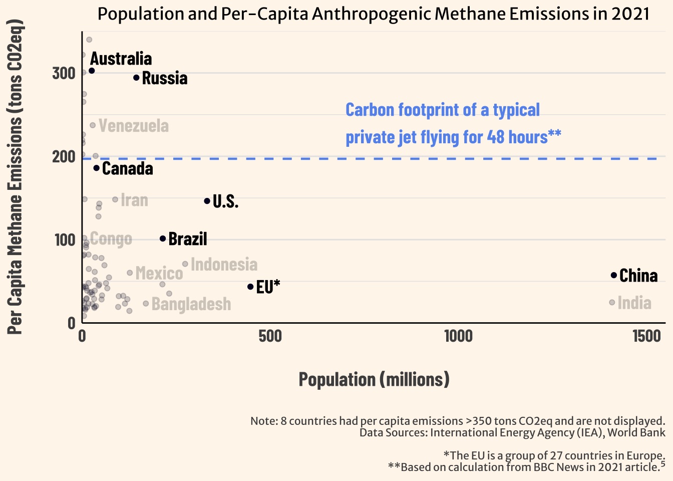
ggplot(scatter_df) +
  geom_point(aes(x = population, y = emissions_pc, alpha = alpha_value), color = "#020122") + # use alpha values from the column
  scale_alpha_identity() + # tell ggplot to use the alpha values as given (without scaling)
  geom_text(data = australia_df, # add text for Australia
            aes(label = country, x = population - 5, y = emissions_pc + 15), # position text so does not overlap
            size = 5, hjust = 0, family = "barlow", fontface = "bold", check_overlap = TRUE) + # adjust other text features
  geom_text(data = other_main_countries, # add text for other main countries
            aes(label = country, x = population + 15, y = emissions_pc), # position text
            size = 5, hjust = 0, family = "barlow", fontface = "bold", check_overlap = TRUE) + # adjust other text features
  geom_text(data = other_notable_countries, # add text for other countries to label
            aes(label = country, x = population + 15, y = emissions_pc), # position text
            alpha = 0.2, size = 5, hjust = 0, family = "barlow", fontface = "bold", check_overlap = TRUE) + # adjust other text features
  labs(x = "Population (millions)",
       y = "Per Capita Methane Emissions (tons CO2eq)", 
       title = "Population and Per-Capita Anthropogenic Methane Emissions in 2021",
       caption = "Note: 8 countries had per capita emissions >350 tons CO2eq and are not displayed.\nData Sources: International Energy Agency (IEA), World Bank\n\n*The EU is a group of 27 countries in Europe.\n**Based on calculation from BBC News in 2021 article.⁵") +
  scale_x_continuous(limits = c(0, 1550), expand = c(0, 0)) + # set limits on min/max x axis values, use expand to tell to have where two axis meet as origin point
  scale_y_continuous(limits = c(0, 350), expand = c(0, 0)) + # set limits on min/max y axis values, use expand to tell to have where two axis meet as origin point
  theme_minimal() +
  theme(panel.grid.major.x = element_blank(), panel.grid.minor = element_blank(),
        axis.title.x = element_text(family = "barlow", face = "bold", size = 15, color = "grey30", # adjust text features for x axis title
                                    margin = margin(20, 0, 0, 0)), # set margin
        axis.title.y = element_text(family = "barlow", face = "bold", size = 15, color = "grey30", # adjust text features for y axis title
                                    margin = margin(0, 20, 0, 0)), # set margin
        panel.grid.major.y = element_line(color = "grey90", size = 0.5), # add horizontal gridlines (major)
        panel.grid.minor.y = element_line(color = "grey90", size = 0.25), # add horizontal gridlines (minor)
        axis.text.x = element_text(family = "barlow", face = "bold", size = 13), # adjust x axis text
        axis.text.y = element_text(family = "barlow", face = "bold", size = 13), # adjust y axis text
        axis.line = element_line(color = "black", size = 0.5), # adjust color and size of axis lines
        plot.title = element_text(family = "merri sans", size = 12.5, hjust = 0.5), # adjust plot title text
        plot.caption = element_text(hjust = 1, size = 8, color = "grey30", family = "merri sans", # adjust caption text
                                    margin = margin(20, 0, 0, 0)), # set margin
        plot.background = element_rect(fill = "#FEF6EC", color = NA), # set plot background
        panel.background = element_rect(fill = "#FEF6EC", color = NA)) + # set panel background
  geom_hline(yintercept = 197, linetype = "dashed", linewidth = 0.8, color = "cornflowerblue") + # add dashed horizontal line at y = 197
  annotate("text", x = 700, y = 240, # position text annotation
           label = "Carbon footprint of a typical\nprivate jet flying for 48 hours**",
           size = 5, hjust = 0, color = "cornflowerblue", family = "barlow", fontface = "bold") # adjust text features

Plot 3 visualization

For my third plot, I don’t have too much extra wrangling to do. I have to make a new version of my data frame for my main countries. I can’t use the one from before because it is in wide format, and for my dodged column plot, I need it in long format. After making my new version just by filtering my original methane data frame, I re-order my country and type factors so that they are in descending order, redefine my custom color palette, and then make my dodged column plot.

Code
##~~~~~~~~~~~~~~~~~~~~~~~~~~~~~~~~~~~~~~~~~~~~~~~~~~~~~~~~~~~~~~~~~~~~~~~~~~~~~~
##                          plot 3 visualization                            ----
##~~~~~~~~~~~~~~~~~~~~~~~~~~~~~~~~~~~~~~~~~~~~~~~~~~~~~~~~~~~~~~~~~~~~~~~~~~~~~~

# filter methane_df to create long format of main_countries
cols_df <- methane_df %>% 
  filter(country %in% c("China", "U.S.", "Russia", "Brazil", "EU*", "Canada", "Australia"))

# re-order countries as factors (for plotting)
cols_df$country <- factor(cols_df$country,
                          levels = c("China", "U.S.", "Russia", "Brazil", "EU*", "Canada", "Australia"))


# re-order countries as factors (for plotting)
cols_df$type <- factor(cols_df$type,
                          levels = c("Energy", "Agriculture", "Waste", "Other"))

# define a custom color palette
custom_colors <- c(
  "Agriculture" = "#D2B48C",
  "Energy" = "#2F2720",
  "Waste" = "#2ca02c",
  "Other" = "#2B4690")

# create dodged column plot
ggplot(cols_df, aes(x = country, y = total_emissions, fill = type)) + # fill columns based on sector
  geom_col(position = "stack") + # specify dodged position to add space between countries
  labs(x = "", # no x axis title
       y = "Methane Emissions (million tons CO2eq)",
       title = "Sources of 2021 Anthropogenic Methane Emissions in selected countries",
       caption = "Data Source: International Energy Agency (IEA)\n\n*The EU is a group of 27 countries in Europe.") +
  scale_fill_manual(values = custom_colors) + # apply custom color palette
  theme_minimal() +
  theme(panel.grid.major.x = element_blank(), panel.grid.minor.x = element_blank(), # remove major and minor vertical grid lines
        panel.grid.major.y = element_line(color = "grey90", size = 0.5), # add horizontal grid lines (major)
        panel.grid.minor.y = element_line(color = "grey90", size = 0.25), # add horizontal grid lines(minor)
        plot.caption = element_text(size = 8, hjust = 1, colour = "grey30", family = "merri sans", # adjust caption text
                                    margin = margin(20, 0, 0, 0)), # set margin
        axis.title.y = element_text(family = "barlow", face = "bold", size = 15, color = "grey30", # adjust y axis title text
                                    margin = margin(0, 20, 0, 0)), # set margin
        axis.text.x = element_text(family = "barlow", face = "bold", size = 16), # adjust x axis text
        axis.text.y = element_text(family = "barlow", size = 13, face = "bold"), # adjust x axis text
        legend.position = c(0.88, 0.85), # specify legend position
        legend.text = element_text(color = "grey30", face = "bold", size = 16, family = "barlow"), # adjust legend text
        legend.title = element_blank(),
        plot.title = element_text(family = "merri sans", size = 12.5, hjust = 0.5), # adjust plot title text and alignment
        legend.background = element_rect(fill = "#FEF6EC", color = NA), # change legend background color
        plot.background = element_rect(fill = "#FEF6EC", color = NA), # change plot background color
        panel.background = element_rect(fill = "#FEF6EC", color = NA)) # change panel background color

Map visualization

I also want to add a world map that highlights the countries that I’m highlighting in the second and third visualizations (China, the U.S., Russia, the EU, Canada, and Australia), which requires two additional packages ({rnaturalearth} for basemap and {sf} for importing geometric objects).

Code
##~~~~~~~~~~~~~~~~~~~~~~~~~~~~~~~~~~~~~~~~~~~~~~~~~~~~~~~~~~~~~~~~~~~~~~~~~~~~~~
##                       setup & data wrangling                             ----
##~~~~~~~~~~~~~~~~~~~~~~~~~~~~~~~~~~~~~~~~~~~~~~~~~~~~~~~~~~~~~~~~~~~~~~~~~~~~~~

# load additional packages
library(rnaturalearth)
library(sf)

# get world map data
world <- ne_countries(scale = "medium", returnclass = "sf")

# exclude Antarctica from the dataset
world <- world[world$name != "Antarctica", ]

# specify the countries to highlight
countries_to_highlight <- c("China", "United States of America", "Russia", "Brazil",
                            "Australia", "Canada",
                            "Austria", "Belgium", "Bulgaria", "Croatia", "Cyprus", "Czech Republic", 
                            "Denmark", "Estonia", "Finland", "France", "Germany", "Greece", "Hungary", 
                            "Ireland", "Italy", "Latvia", "Lithuania", "Luxembourg", "Malta", "Netherlands", 
                            "Poland", "Portugal", "Romania", "Slovakia", "Slovenia", "Spain", "Sweden")

# specify the countries that will receive a custom label (will use Denmark to label EU)
countries_to_label <- c("China", "United States of America", "Russia", "Brazil",
                        "Australia", "Canada", "Denmark")

# filter world data for highlighted and labeled countries
highlighted_countries <- world[world$name %in% countries_to_highlight, ]
labeled_countries <- world[world$name %in% countries_to_label, ]


# calculate centroids for countries to label and store in data frame
centroids <- st_centroid(labeled_countries$geometry)
centroids_df <- data.frame(name = labeled_countries$name,
                           lon = st_coordinates(centroids)[,1],
                           lat = st_coordinates(centroids)[,2])

# change 'United States of America' to 'U.S.' and 'Denmark' to 'EU*'
centroids_df$name <- recode(centroids_df$name,
                            'United States of America' = 'U.S.',
                            'Denmark' = 'EU*')

# adjust centroid longitude to move the labels left or right
centroids_df <- centroids_df %>%
  mutate(lon = case_when(
    name == "Russia" ~ lon + 50,
    name == "U.S." ~ lon + 60,
    name == "EU*" ~ lon - 20,
    name == "Canada" ~ lon - 1,
    name == "China" ~ lon + 55,
    name == "Brazil" ~ lon + 45,
    TRUE ~ lon
  ))

# adjust centroid latitude to move the labels up or down
centroids_df <- centroids_df %>%
  mutate(lat = case_when(
    name == "Russia" ~ lat + 20,
    name == "Canada" ~ lat + 24.5,
    name == "U.S." ~ lat - 10,
    name == "China" ~ lat - 10,
    name == "Australia" ~ lat - 20,
    name == "Brazil" ~ lat - 20,
    TRUE ~ lat
  ))
Code
##~~~~~~~~~~~~~~~~~~~~~~~~~~~~~~~~~~~~~~~~~~~~~~~~~~~~~~~~~~~~~~~~~~~~~~~~~~~~~~
##                              create map                                  ----
##~~~~~~~~~~~~~~~~~~~~~~~~~~~~~~~~~~~~~~~~~~~~~~~~~~~~~~~~~~~~~~~~~~~~~~~~~~~~~~

ggplot(data = world) +
  geom_sf(fill = "gray", color = "grey90", linewidth = 0.05) +
  geom_sf(data = highlighted_countries, fill = "#020122", size = 0.5) +
  geom_text(data = centroids_df, aes(x = lon, y = lat, label = name), hjust = "right", color = "#020122", family = "barlow", fontface = "bold", size = 7) +
  labs(caption = "*The EU is a group of 27 countries in Europe") +
  theme_minimal() +
  theme(panel.grid.major = element_blank(), panel.grid.minor = element_blank(),
        axis.text.x = element_blank(), axis.ticks.x = element_blank(),
        axis.title = element_blank(),
        plot.background = element_rect(fill = "#93B88E", color = NA),
        panel.background = element_rect(fill = "#93B88E", color = NA),
        plot.caption = element_text(hjust = 1, size = 11, color = "#020122", family = "merri sans", margin = margin(20, 0, 0, 0)),)

Making infographic

To create my infographic, I rendered my work in R to an HTML document and dragged the embedded plots onto a Canva document, which I then designed further and added text to as well. At the end of all my diligent work, I made the following infographic!

Infographic on anthropogenic methane emissions in 2021

My visualization approach

When creating my plots in R and then my infographic in Canva, I thought through several aspects that are integral to effective data visualization practice. In this final section, I’ll go through each of these aspects and comment on my approach.

Graphic form

For my first plot, I decided to do a treemap because it is a useful way to compare different parts of a ‘whole’, which in this case was total global emissions. Generally, treemaps are a better way to display this than a pie chart, as humans are much worse at understanding relative sizes that are part of a rounded object. In my second plot, I decided on scatterplot because I thought that seeing the distribution of per capita emissions among all countries, with the countries of focus highlighted, would be the easiest way to put understand how these countries compared to others. For my third plot, I made a dodged column plot because it seemed like a simple and effective way to communicate to my audience the nuances of how each of the countries of focus have emissions coming from different types of sources.

Text

This is a broad category, and I made a lot of decisions regarding the text used in my plots. Every word of text that I included was thoughtfully considered. My most major decisions were in my scatterplot, where I included labeled points (not only of focus countries but also other comparison countries), an annotation (for contextualizing emissions data), and a note in my caption to tell the audience directly that there were actually 8 countries with even higher per capita emissions than what was shown within the bounds of the plot.

Themes

I made a great deal of theme adjustments in each of my plots. For the first plot, the main theme choice was to orient my legend the way that I did, at the very top of the plot so the reader would read it immediately. In the second and third plot, I decided to get rid of vertical grid lines but keep some horizontal grid lines to help my audience to more easily see where countries lined up along the y-axis. I also moved the axis titled farther away from the axis in both of these plots, which I think is easier on the eyes.

Colors

I made a custom color palette that I thought was unique, aesthetically pleasing, color-blind friendly (checked using the “let’s get color blind” Chrome Extension), and fit the variables that I was representing. I reused the colors from my first plot in my last plot, where they represented the same thing in each. I also reused the dark blue color quite a bit in my infographic, most notabley for shading the highlighted areas in my map and then to highlight these same countries as point in my scatterplot. All of the text that I wrote in Canva was also this color.

Typography

I chose to use Merriweather Sans for the title and captions of my plots and Barlow Condensed to use for all other text within my plots (labeling rectangles in plot 1, labeling points in plot 2, plot 2 annotation, legend in plot 1 and 2, all axis titles and text). Using a condensed typeface within my plots was nice because it allowed me to fit text more easily. I also think that it gave my visuals a more serious tone, especially since it was so thin that I had to bold it everywhere that I used it. I definetly spent more time selecting this typeface, and then I determined that Merriweather Sans was a good matching typeface for titles and captions of my plots. In Canva, I used the typeface Alike for most text, as it seemed both unique but still easy to read. I used Agrandir for my infographic title and other larger text in my infographic. Its a pretty basic typeface, but I couldn’t find anything that I liked better.

General design

I definitely thought a lot about where I wanted my readers eyes to go. This is why I re-ordered factors so that the legends where in descending order in the first and third plot. I also re-ordered the factors my columns to be in descending order in my third plot. To avoid information overload in my first plot, I changed the name of many countries to empty strings. I also selected points to label carefully in my second plot for this reason. In addition, I also feel like I did a good job combining the plot and text elements in Canva so that the ideas flowed naturally using a visual hierarchy.

Contextualizing data

As previously mentioned, I used an annotation in my second plot to contextualize emissions to my audience. Recently, there have been a lot of news stories about the use of private jets among celebrities, so I felt like this was a good way to contextualize emissions, especially since the plot had to do with emissions per individual and flying a private jet is a very individualistic action. In my second plot, I also added the labels for other countries that weren’t the primary focus, like Venezuela, Congo, Mexico, and Bangladesh, as a way to provide more context for the emissions of countries around the world.

Centering my primary message

I think that the map that I included alongside the large text in the middle of my infographic was very effective at centering my message that there are some countries that have a disproportionately large amount of methane emissions relative to their population. Another point that I wanted to emphasize was how methane is mostly from fossil fuels, which is one reason why I put my treemap first. I also feel like the point I discussed in the second paragraph of text, right after my intro, emphasized this point by mentioning the 2021 study by McGill University scientists.

Considering accessibility

I spent a great deal of time ensuring that the colors I chose were color-blind friendly using the “let’s get color blind” Chrome Extension. I tested using the simulate, daltonized, and simulate daltonized versions of Deuteranomaly, Protanomaly, and Tritanomaly. I also wrote alt text (embedded in images below) for all three of my plots (and my map) to ensure that blind users could still understand the figures in my infographic.

Treemap (rectangle divided up into smaller rectangles) where each smaller rectangle represents anthropogenic methane emissions in 2021 from a specific country and sector (rectangles are colored by sector). Energy makes up 55% of global emissions, about half of which comes from the China, Russia, the U.S., Iran, and India. Agriculture makes up 29% of global emissions, waste makes up 14%, and 2% are from other sources.

Map of the world where six countries (Canada, the U.S., Brazil, Russia, China, and Australia) and the 27 countries of the European Union are highlighted.

Scatterplot of many countries showing 2021 population on the x-axis and 2021 per-capita methane emissions (in tons of CO2eq) on the y-axis. Canada, the U.S., Brazil, Russia, China, and Australia are labeled and emphasized. Australia and Russia are in the top left of the plot, with per-capita emissions around 300 tons CO2eq. Australia’s population is about 25 million people, while Russia’s is about 200 million. Canada is around 200 tons CO2 eq, right below a dashed line indicating the carbon footprint of a typical private jet flying for 48 hours. Canada’s population is around 35 million people. The U.S. is at around 150 tons CO2eq and has a population of about 300 million people. Brazil is at around 100 tons CO2eq and has a population of about 250 million people. China is at around 55 tons CO2eq and has a population of about 1,400 million (1.4 billion) people. Latley, the EU is at around 45 tons CO2eq and has a population of about 450 million people.

Bar graph with 7 vertical columns, where the height represents the total methane emissions in 2021 (measured in million tons of CO2eq). From left to right (aligns with highest to lowest total emissions), the 7 vertical columns are China, the U.S. Russia, Brazil, the EU, Canada, and Australia. China is at about 80,000 million tons CO2eq, the U.S. and Russia are both close to 45,000 tons CO2eq, Brazil and the EU are both around 20,000 tons CO2eq, and Canada and Australia are both less than 10,000 tons CO2eq. The 7 columns are each seperated into four colored components, one for each type of emissions source (energy, agriculture, waste, and other). Russia’s energy sector (85%) and Brazil’s agricultural sector (65%) stand out as particularly high. Emissions from energy in the EU (29%) and Brazil (16%) make up a relatively low share of their total emissions, compared to about 60 to 70% in China, the U.S., Canada, and Australia.

Applying a lense of Diversity, Equity, & Inclusion (DEI)

One decision that I thought about through a DEI lense was the decision of which countries to highlight in my plots, as I had some leeway in these decisions. I wanted to ensure that I wasn’t being biased towards any specific country when excludeing or singling-out specific countries in my analysis. This was somewhat difficult when highlighting countries because I was kind of singling them out, but I tried my best to highlight many examples of countries around the world to avoid really placing the blame exclusively on a certain type of country.

References

International Energy Agency (IEA). 2022a. “Methane Tracker Database.” https://www.iea.org/data-and-statistics/data-product/methane-tracker-database.
———. 2022b. “Global Methane Tracker: Documentation.” https://iea.blob.core.windows.net/assets/b5f6bb13-76ce-48ea-8fdb-3d4f8b58c838/GlobalMethaneTracker_documentation.pdf.
———. 2024. “History: From Oil Security to Steering the World Toward Secure and Sustainable Energy Transitions.” https://www.iea.org/about/history.
The World Bank. n.d. “Population, Total.” https://data.worldbank.org/indicator/SP.POP.TOTL.

Citation

BibTeX citation:
@online{ghanadan2024,
  author = {Ghanadan, Linus},
  title = {Infographic on {Anthropogenic} {Methane} {Emissions}},
  date = {2024-03-12},
  url = {https://linusghanadan.github.io/blog/2024-03-12-post/},
  langid = {en}
}
For attribution, please cite this work as:
Ghanadan, Linus. 2024. “Infographic on Anthropogenic Methane Emissions.” March 12, 2024. https://linusghanadan.github.io/blog/2024-03-12-post/.