A collection of data visualizations that I have created using the R programming language.
A collection of data visualizations that I have created using the Python programming language.
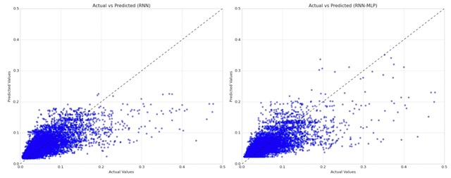
In this blog post, I build two models to explore potential advantages of adding an additional hidden layer to a traditional Recurrent Neural Network (RNN) architecture.
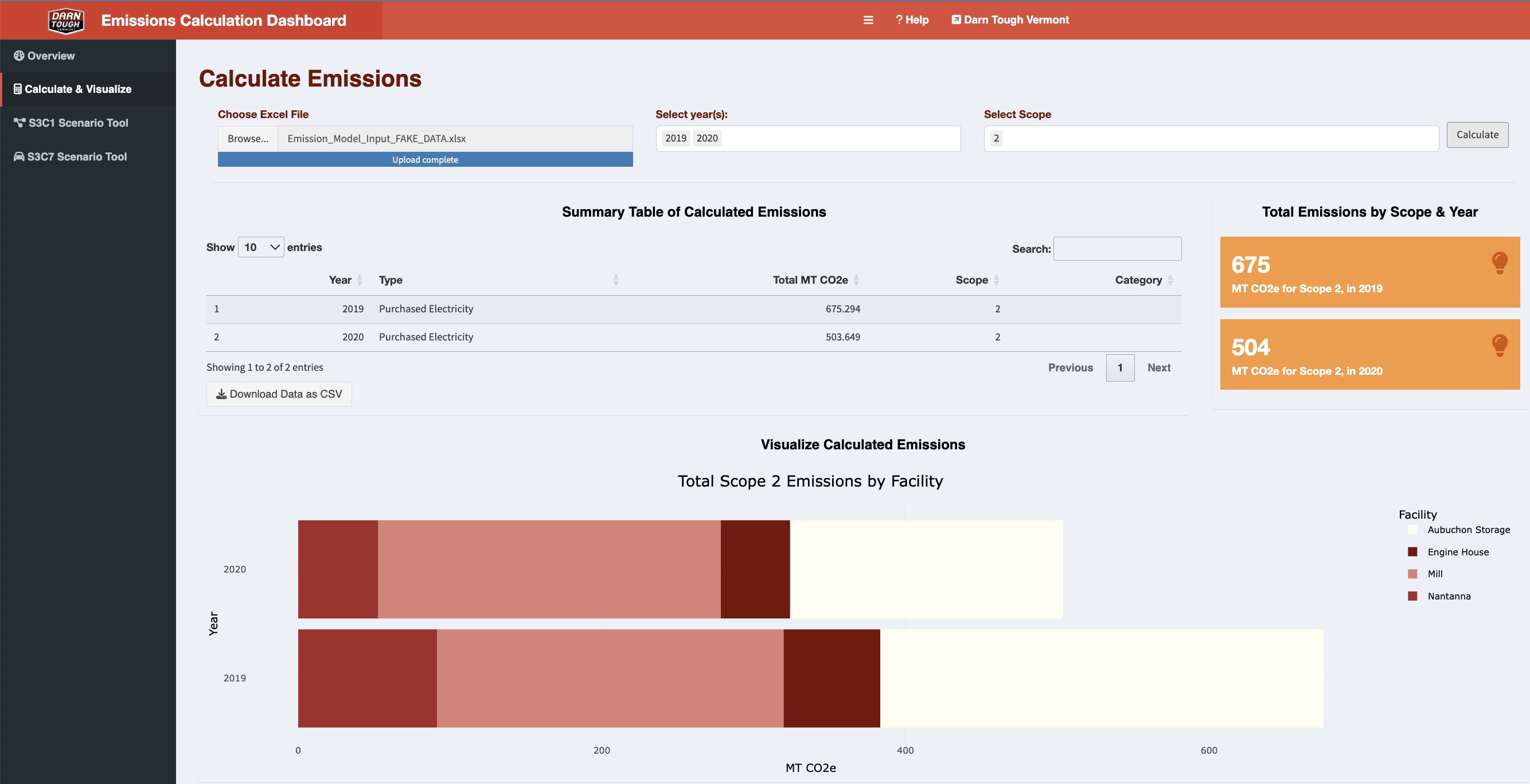
This blog post provides an overview of my master’s capstone project, including screenshots from deliverables that are shareable under my group’s non-disclosure agreement.
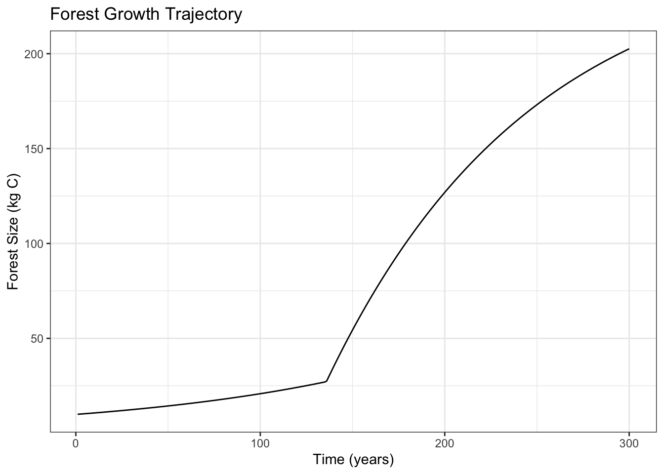
Using a model of forest growth, I run a 300-year continuous dynamic simulation for the forest and then conduct a global sensitivity analysis looking at variation in maximum forest size.
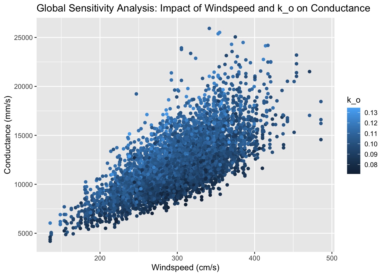
In this analysis, I look at an atmospheric conductance model based on vegetation height and windspeed, and I apply a variance-based sensitivity analysis by calculating Sobol indices.
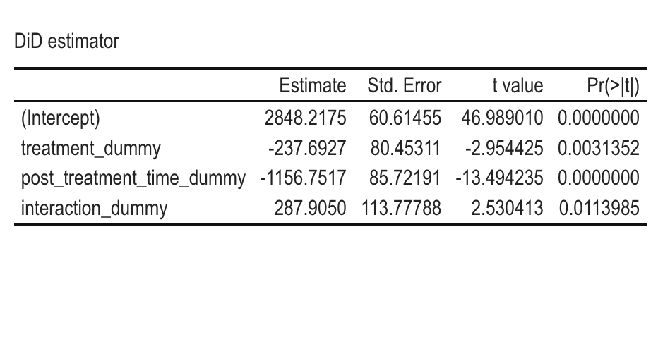
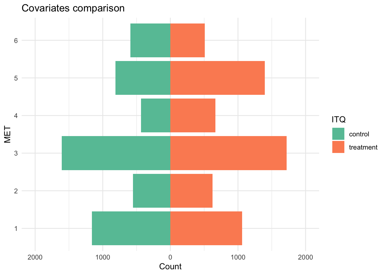
For this analysis, I estimate the Average Treatment Effect (ATE) of the 1998 Prospera cash-transfer program on the value of animals owned by a household.
Disclaimer: The data used in this blog was synthetically generated (i.e., data is fake so results have no real implications).
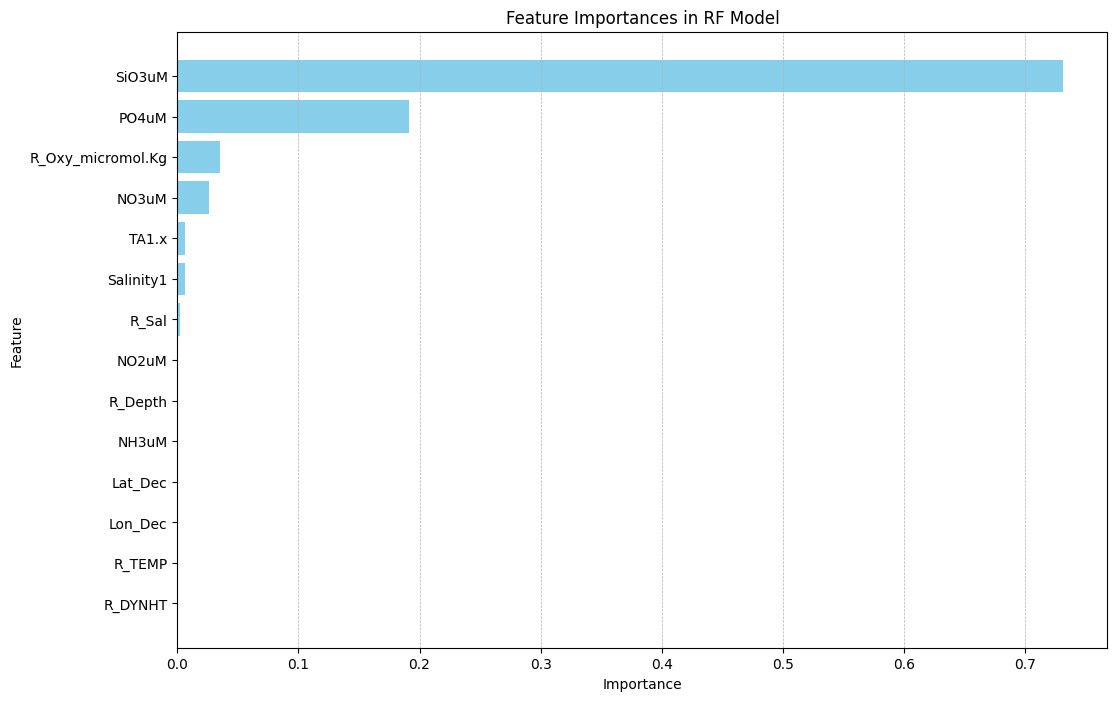
For this blog post, I build and compare four regression models that predict DIC in water samples. I also analyze feature importances in the best performing model.
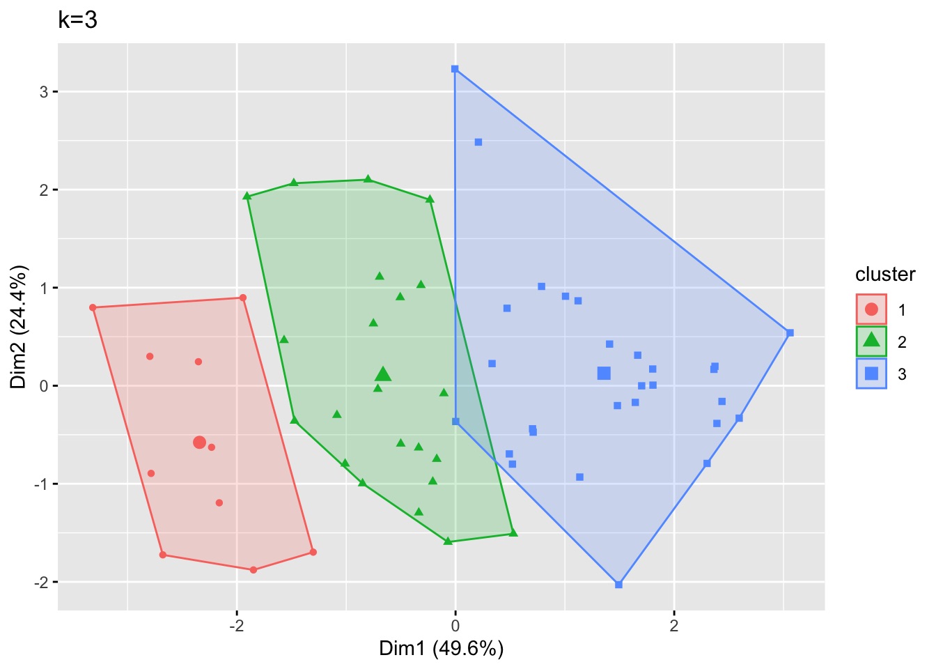
For clustering, I use data from Roberts et al. 2008 on biological contaminants in Port Jackson Bay.
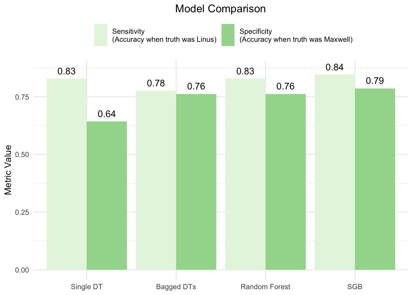
In this blog post, I build and compare four classification models that predict whether a given song was in my Spotify collection or that of my friend Maxwell. I also analyze feature importances in the best performing model.
This blog post explains the process of creating an infographic on anthropogenic methane emissions in 2021, with a particular focus on the data visualization considerations and choices made.
My favorite data science project from graduate school!
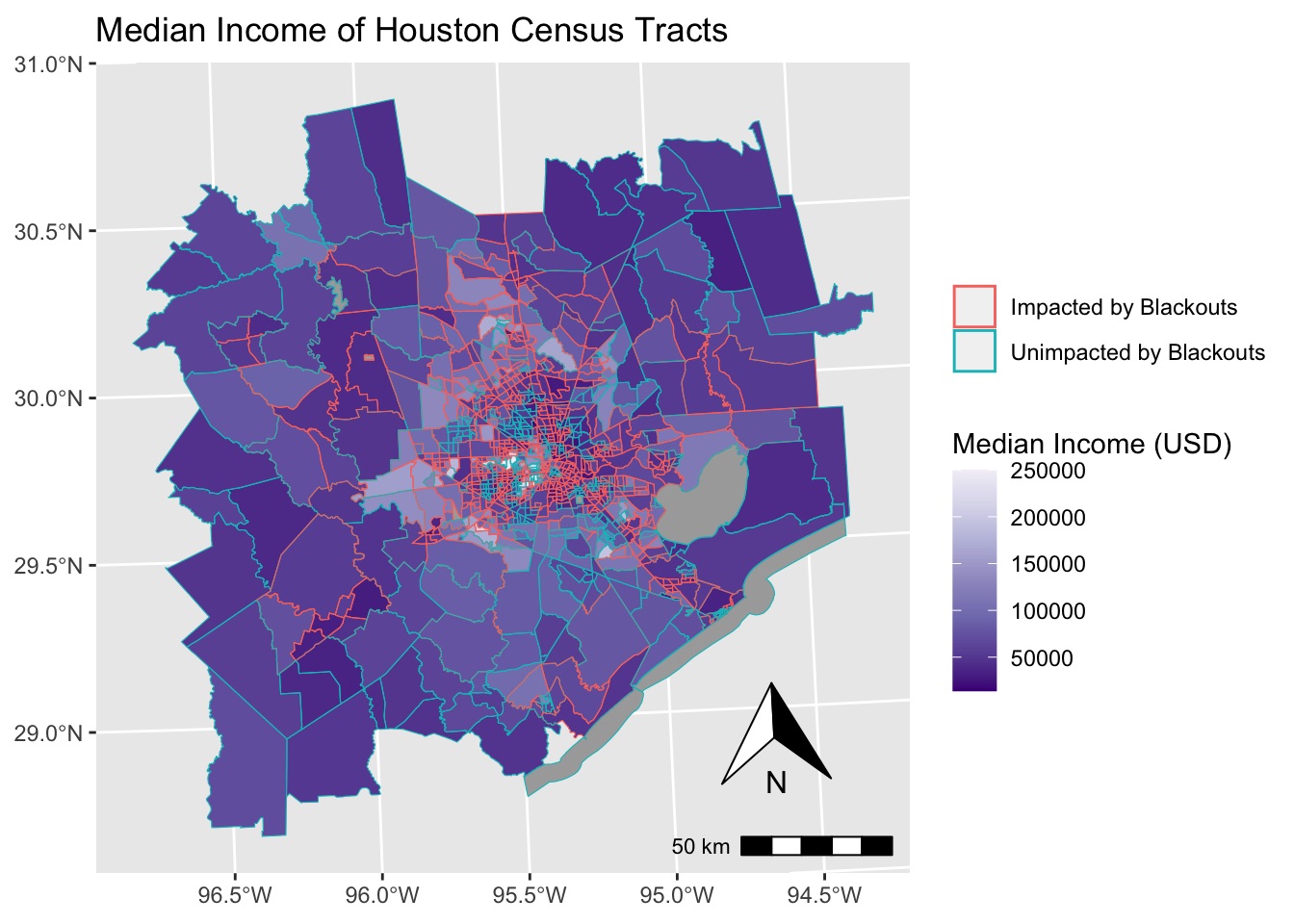
Using data from the NASA’s VIIRS instrument, I look at where residential blackouts occurred. Then, I visualize this data at the census tract level and analyze the relationship to median income.
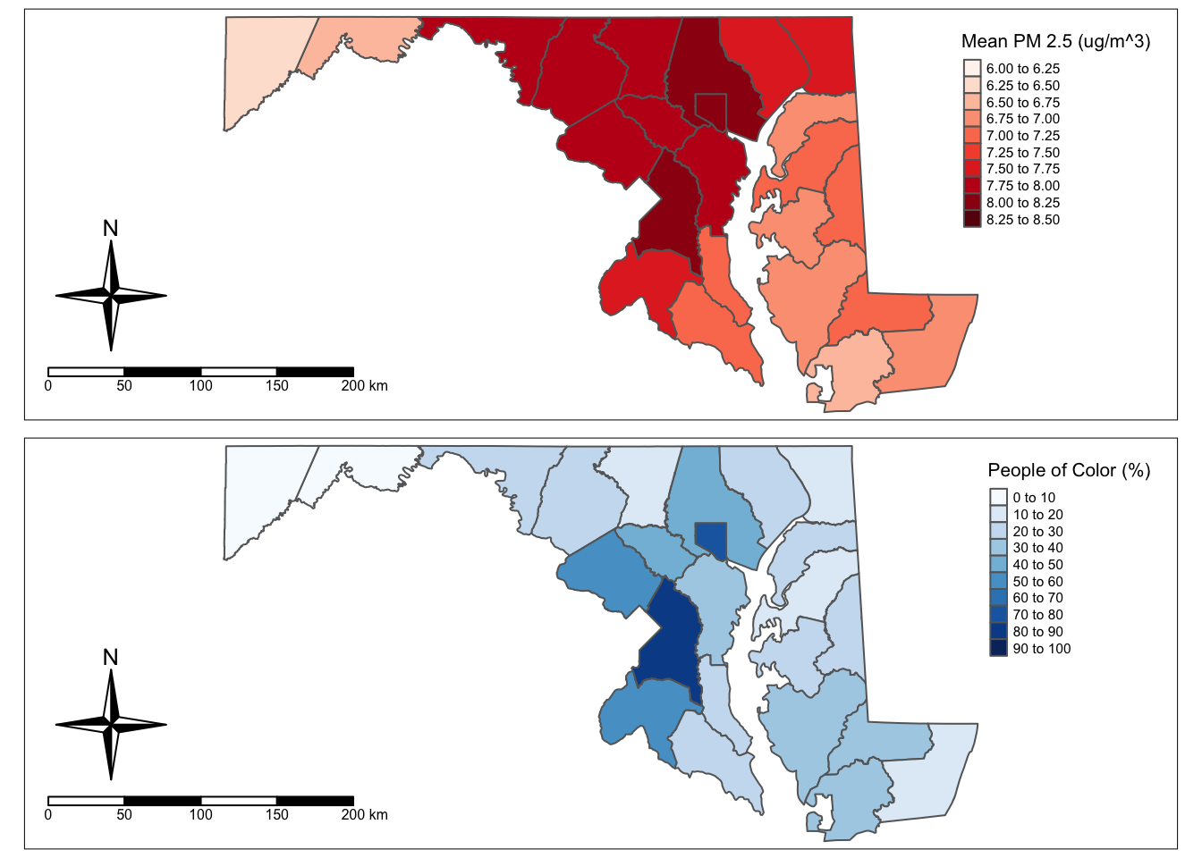
Using data from the EPA’s Environmental Justice Screening and Mapping Tool (EJScreen), I create basic visualizations looking at the relationship between PM 2.5 concentrations and demographics.
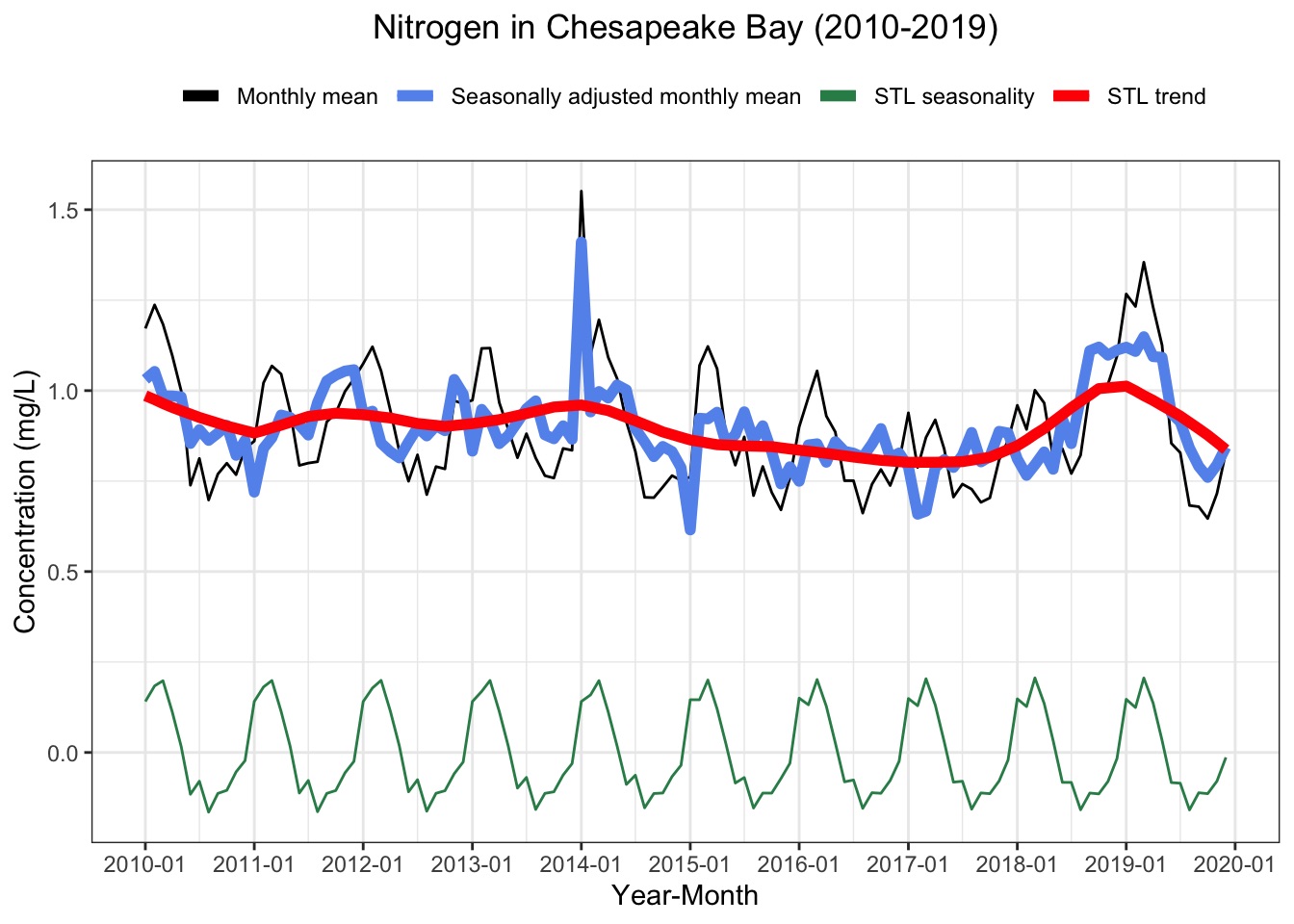
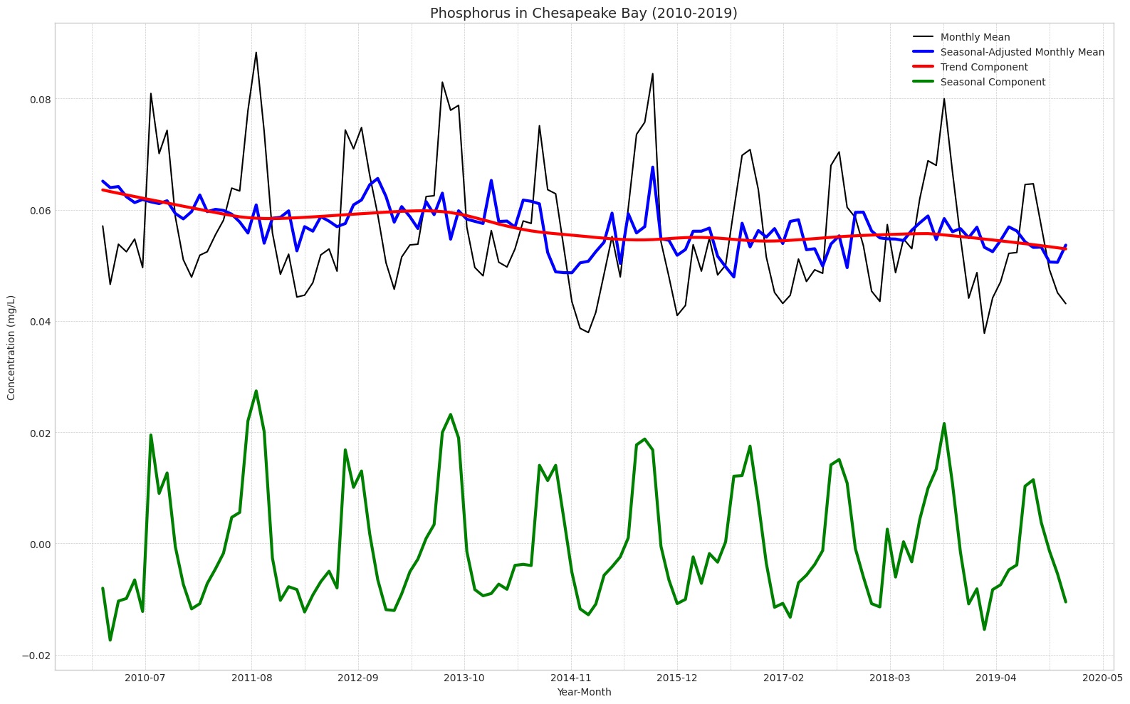
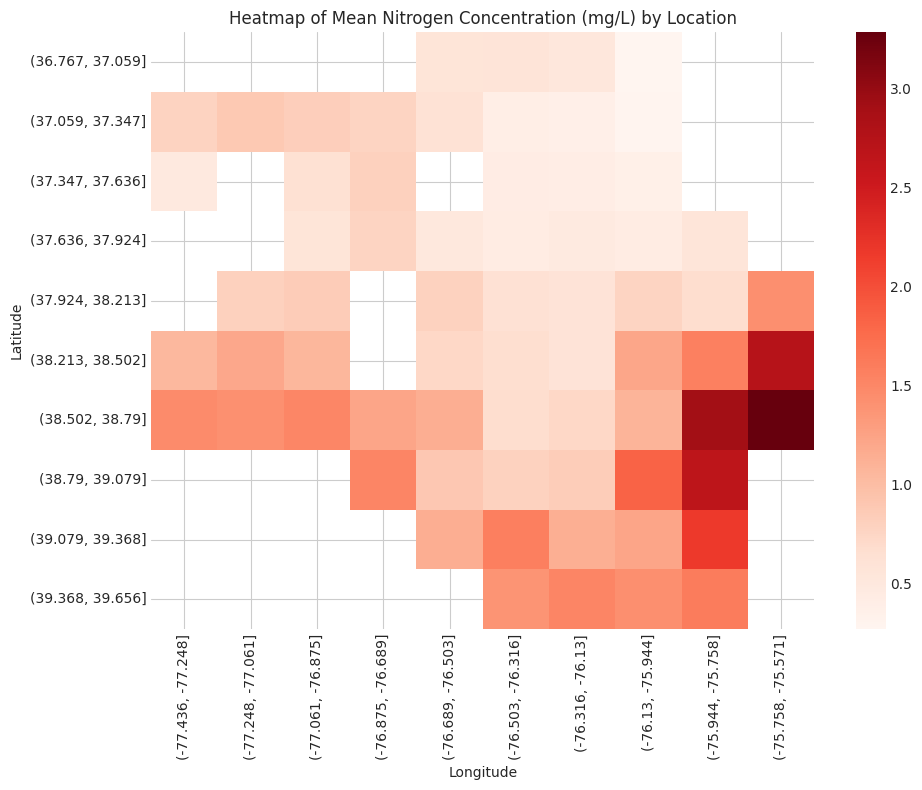
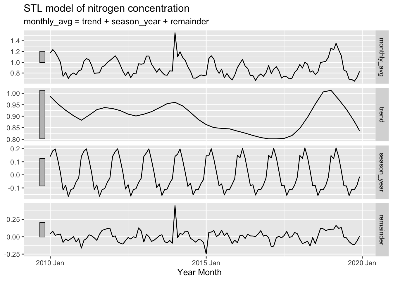
This analysis seeks to better understand the seasonality and trends of nitrogen and phosphorus concentration in Chesapeake Bay tidal regions since the 2010 introduction of federal water quality requirements under the Clean Water Act.
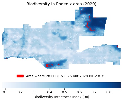
In this analysis, I retrieve raster data of Biodiversity Intactness Index (BII) from the Microsoft Planetary Computer (MPC) catalog. This allows me to calculate areas of interest based on changes in biodiversity and show my results on a map.
This analysis uses Python to extract land cover statistics from a USGS raster dataset on land cover classification in the area surrounding Mount Whitney in California.