Time Series Visuals for Statistics Final Project
Context for plots: In this final project for my statistics course, I proposed statistical question on how nutrient concentrations have changed since Clean Water Act protection measures (implemented in 2010) and found appropriate data for answering the question (used over 43,000 samples from the Bay’s tidal regions). Specifically, I constructed two Seasonal-Trend using LOESS (STL) decomposition models to conduct time series analysis of nitrogen and phosphorus concentrations (selected length of seasons based on autocorrelation). For each pollutant, visualized model parameters comparatively. In addition, ran regressions to determine the proportion of variation attributable to seasonality and the 95% confidence interval for 10-year trend component.
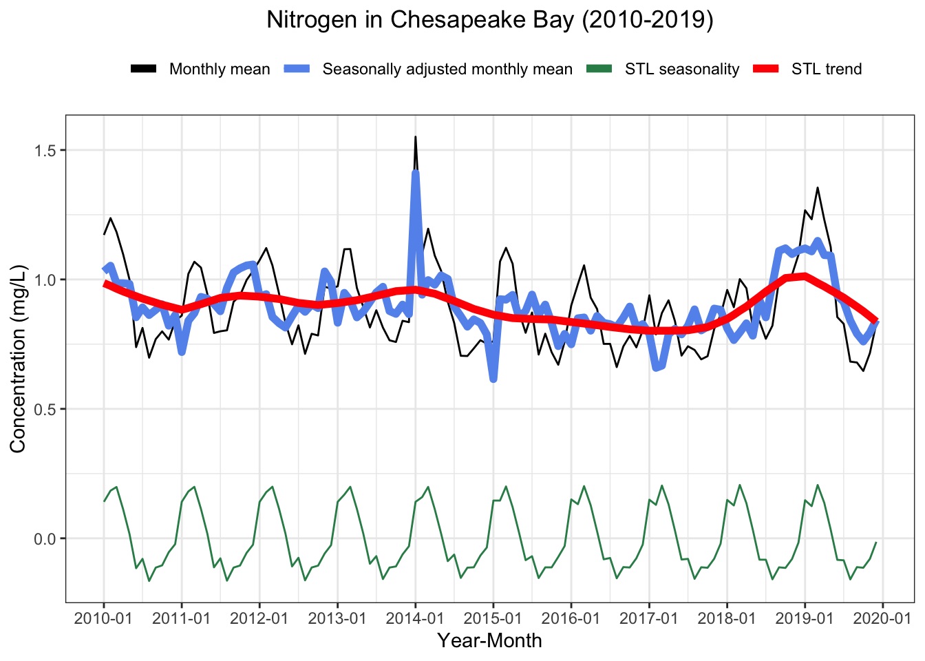
Caption: The trend component (red) indicates that there was a negligible downward trend (95% CI: -0.28% to -0.05% over 10-year time series). Interestingly, this component also tells us that the increase in concentrations seen over the course of 2018, as well as the subsequent decrease seen during 2019, were both indicative of non-seasonal trends. Furthermore, there is a distinct seasonal component (green) to nitrogen concentrations in the Chesapeake Bay tidal regions (explains 55% of the variation in monthly mean). Each year, concentrations increased sharply around December.
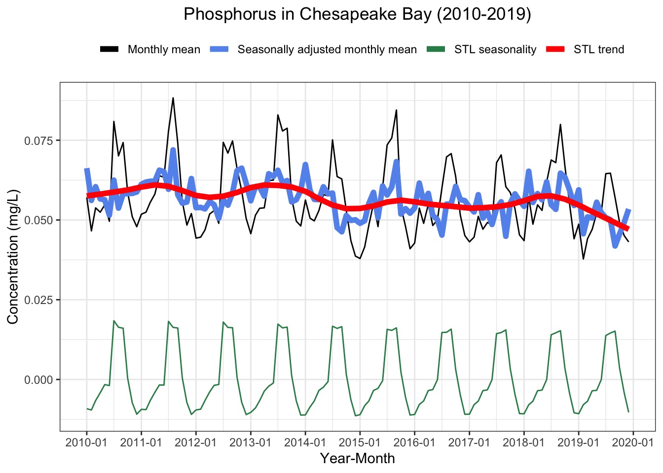
Caption: The trend component (red) indicates a slightly more pronounced downward trend (95% CI: -0.52% to -0.38% over 10-year time series) in comparison to nitrogen. Compared to nitrogen, there was also a more distinct seasonal component (green) for phosphorus concentrations (explains 76% of the variation in monthly mean). Unlike nitrogen, phosphorus concentrations shot up in the middle of the year around May, had a relatively flat peak lasting from June to August, and then shot back down at the end of the Summer.
Interactive Sunburst Plot for Master’s Capstone Project
Note: Plot is not interactive on this webpage (the image below is a screenshot from an application developed for Darn Tough Vermont)
Context for plot: For my Master’s capstone project, I spent six months working with three classmates and the outdoor apparel manufacturer Darn Tough Vermont to develop a Microsoft Excel template and an interactive application. Together, these two products streamline Darn Tough’s workflow for carbon accounting and sustainability analysis. Specifically, the application allows for a user to upload their Excel template (containing input values) to calculate yearly greenhouse gas emissions, visualize historical data, and conduct scenario analysis based on adjustable input variables (e.g., compare scenarios for differing levels of wool procurement).
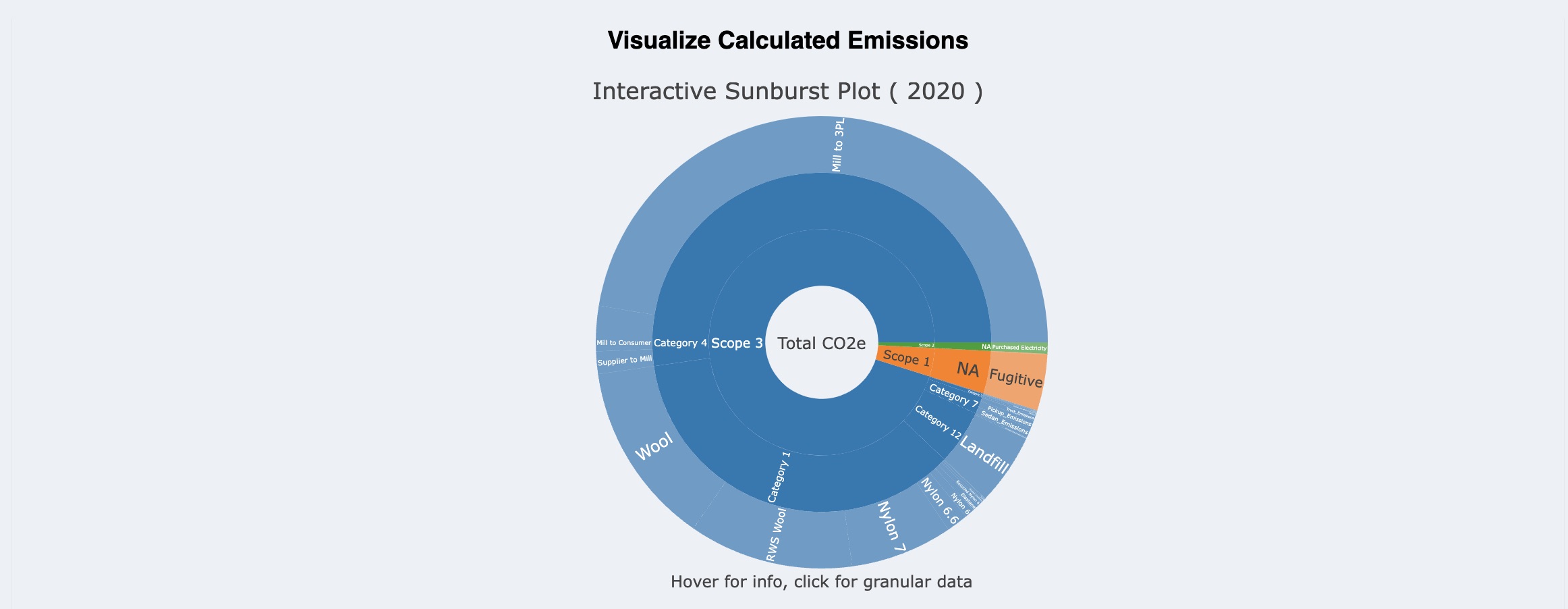
Caption: The interactive sunburst plot allows users to analyze emissions in terms of Scope, Category (for Scope 3), and input variables (e.g., Wool Fiber). Through clicking on a segment of the plot, users can more easily see the granular data. In addition, the user can hover over a segment to access exact values for emissions and percent of total emissions (Note: Fake Data).
Chloropleth Maps for Geospatial Analysis Project
Context for plots: For a project in my Geospatial Analysis class, I used data from the NASA’s VIIRS instrument to conduct a spatial analysis of the 2021 Houston Power Crisis. Specifically, I looked at census tracts in the Houston metropolitan area where residential blackouts occurred and how this relates to median income of census tracts.
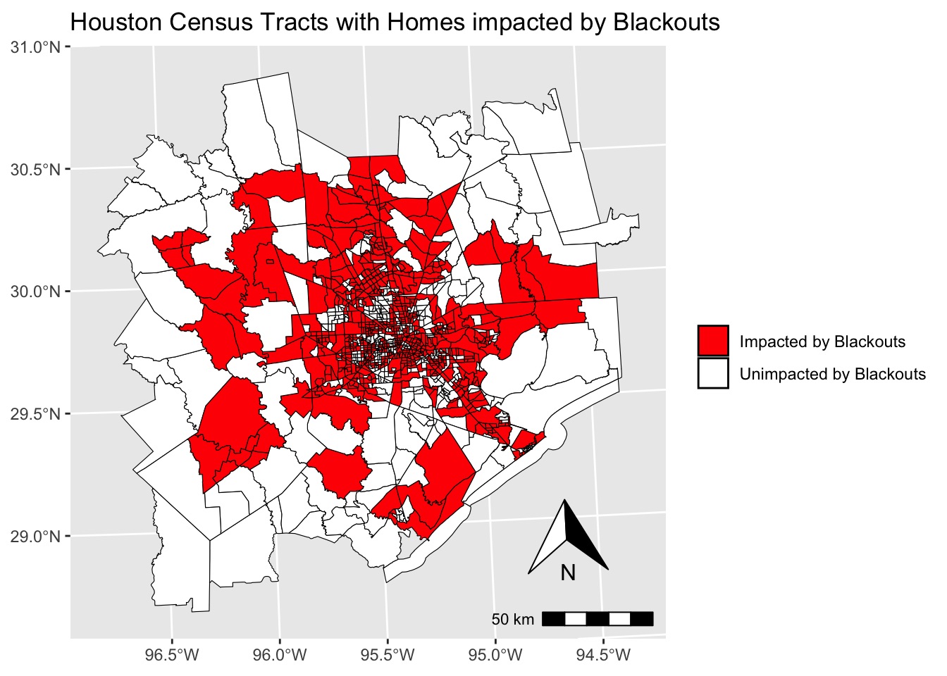
Caption: Only a couple of the census tracts on the border of the Houston metropolitan area were impacted by residential blackouts. Otherwise, there are no obvious spatial patterns in where blackouts occurred.
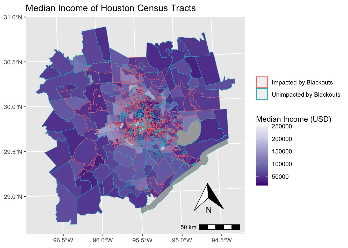
Caption: There does not appear to be a significant relationship between median income and whether a census tract was impacted by residential blackouts. However, upon closer examination, it can be seen that 9 of the 10 census tracts with a median income above $240,000 were unimpacted by residential blackouts, demonstrating that very wealthy census tracts avoided residential blackouts at a disproportionately high rate compared to other census tracts. It is possible that people in these high income census tracts owned backup generators that they used, or it could be that these census tracts have special access to more reliable forms of electricity from local utilities.
Visuals for Data Visualization & Communication Final Project
Context for plots: For a final project in my Data Visualization & Communication class, I created these plots as part of an infographic on anthropogenic methane emissions in 2021. My data came from the International Energy Agency, which provided granularity regarding the country and sector (energy, agriculture, waste, and other) of emissions.
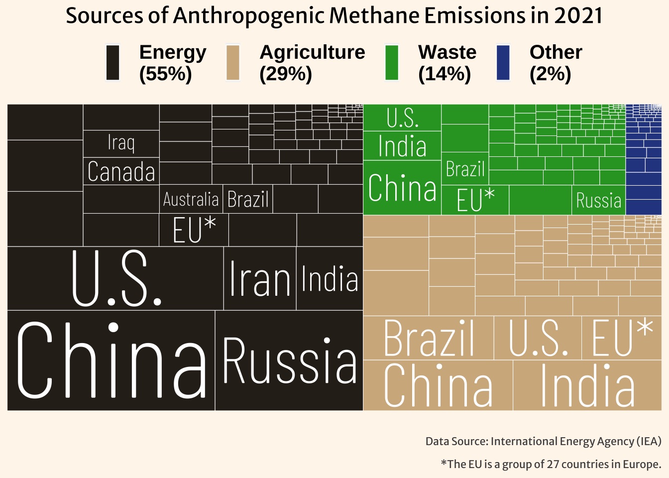
Caption: The energy sector made up 55% of global anthropogenic methane emissions in 2021, about half of which came from China, Russia, the U.S., Iran, and India. Meanwhile, agriculture and waste contributed 29% and 14% of global emissions, with the remaining 2% coming from other sources.
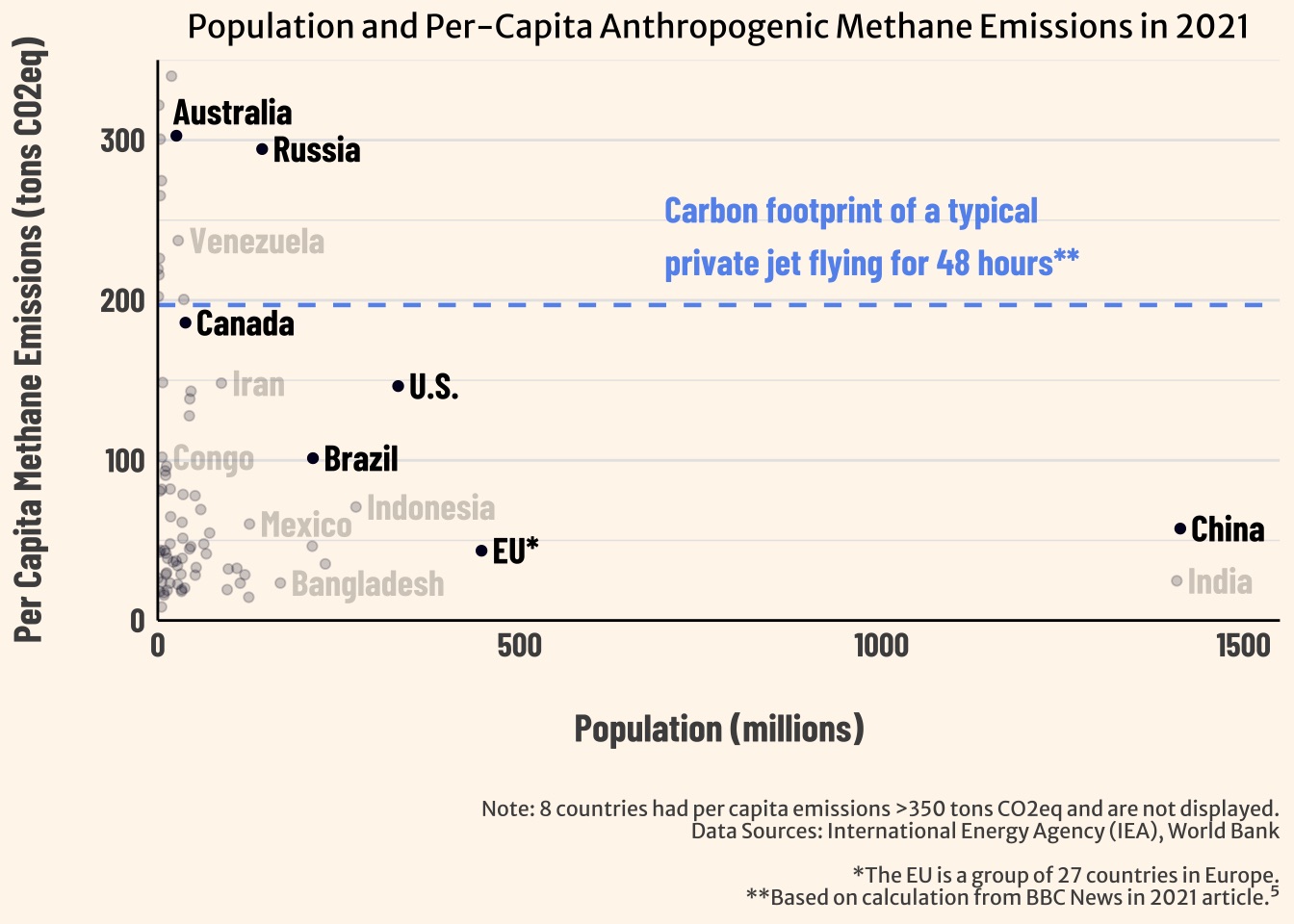
Caption: In terms of methane emissions per person, the EU and China were fairly similar to other countries, while the U.S., Canada, Australia, and Russia were significantly higher than most. The average American emitted ~150 tons, more than three-times the ~50 tons emitted by the average person living in the EU. The average Canadian emitted ~200 tons, roughly equivalent to the total carbon footprint of a 48-hour private jet ride. Among the highlighted countries, Australia and Canada had the highest emissions per person, at ~300 tons.
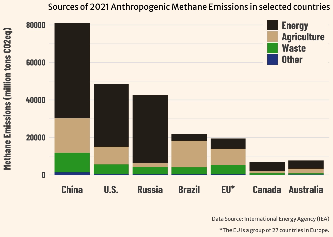
Caption: As a percent of country-level methane emissions, Russia’s energy sector (85%) and Brazil’s agricultural sector (65%) stand out as particularly high. Meanwhile, energy-related emissions in the EU (29%) and Brazil (16%) make up a relatively low share of their total emissions, compared to about 60-70% in China, the U.S., Canada, and Australia.
Citation
@online{ghanadan2024,
  author = {Ghanadan, Linus},
  title = {Visualization {Portfolio} {(R)}},
  date = {2024-07-24},
  url = {https://linusghanadan.github.io/blog/2024-7-24-post/},
  langid = {en}
}