The Chesapeake Bay is the largest estuary in the United States, and the largest body of water that is regulated under the Clean Water Act (U.S. Environmental Protection Agency 2023). Federal regulation pertaining to the Bay took decades to implement, and this is in large part because of the Bay’s large size and the many stakeholders involved. In the 1970s, the Bay was identified as one of the first areas in the world to have a marine dead zone, a phenomenon that literally suffocates aquatic life due to lack of oxygen in the water. Despite dead zones being identified in the 1970s, it was not until 2000 that the Bay was designated as an “impaired water” under the Clean Water Act. Then, it took another ten years, until 2010, for the EPA to take the next step of issuing Total Maximum Daily Load (TMDL) requirements, the regulatory action mandating water quality improvement.
Specifically, a TMDL is the maximum amount of a particular pollutant that a body of water can receive and still meet applicable water quality standards (U.S. Environmental Protection Agency 2023). This maximum amount is calculated in pounds based on measurements taken at areas where pollution is likely to end up in the Bay. In their 2010 regulation, the EPA established TMDL requirements for nitrogen, phosphorus, and sediment. Nitrogen and phosphorus, referred to as nutrients because of their role in providing nutrition to many animals and plants, cause algal blooms, which cause marine dead zones through taking in dissolved oxygen and blocking sunlight. Sediment contributes to dead zones by blocking sunlight as well, leading it to also be included in the 2010 TMDL requirements.
This analysis will focus on nitrogen and phosphorus, the two pollutants responsible for algal blooms in the Chesapeake Bay. A 2022 study found that agricultural runoff was the largest source of nutrient pollution, accounting for 48% of nitrogen and 27% of phosphorus in the Chesapeake Bay (Chesapeake Progress, n.d.). Both of these pollutants also get to the Bay as a result of urban and suburban runoff, wastewater treatment plants releasing treated water, and natural sources (e.g., runoff from forests, wetlands, etc.). In addition, about 25% of nitrogen that ends up in the Bay comes from air pollution that is originally emitted to the atmosphere by sources such as cars and factories (Burns et al. 2021. Through a process called atmospheric deposition, these nitrogen compounds react with other chemicals to become nitrous oxides, which can be deposited back to Earth’s surface through precipitation or as dry deposition.
Through conducting a time series analysis of post-2010 nitrogen and phosphorus concentration measurements, my goal is to better understand how concentrations have changed since the introduction of TMDL requirements. I’m also interested in the nature of any seasonality and whether the three time series components (i.e., seasonal, trend, and residual) are consistent across both nitrogen and phosphorus.
Data
Yearly water quality data on the Chesapeake Bay’s tidal and non-tidal regions going back to 1984 is publicly available on the Chesapeake Bay Program (CBP) DataHub (Chesapeake Bay Program DataHub, n.d.). Data is organized into either Tier 1, 2, or 3 depending on how it was collected. While Tier 1 and 2 data can be collected by any interested group, Tier 3 data is collected by monitoring stations overseen by experienced professionals. Only Tier 3 data can be used for governmental regulatory assessments.
For my analysis, I will be using 2010 to 2019 Tier 3 data collected at 143 different monitoring stations positioned throughout the Chesapeake Bay tidal regions, which includes the mainstem Bay and tributary components. Across the 10 years that we are looking at, we’ll have more than 43,800 nitrogen observations and more than 43,500 phosphorus observations.
Below, we import the Python libraries used in this analysis. Then, we read in the yearly water quality data using their CBP DataHub URL. We also process the data by creating separate data.frames for total nitrogen and phosphorus measurements.
Code
import numpy as npimport pandas as pd# Visualization librariesimport matplotlib.pyplot as pltimport seaborn as sns# Statistics librariesimport statsmodels.api as smfrom statsmodels.tsa.seasonal import STLfrom statsmodels.regression.linear_model import OLSfrom statsmodels.iolib.summary import Summaryfrom scipy import stats# Other librariesimport requestsfrom io import BytesIO
Code
# Create a list of data URLsexcel_urls = ['https://datahub-content.chesapeakebay.net/traditional_annual_tidal_02jun21/2019_CEDR_tidal_data_01jun21.xlsx','https://datahub-content.chesapeakebay.net/traditional_annual_tidal_02jun21/2018_CEDR_tidal_data_01jun21.xlsx','https://datahub-content.chesapeakebay.net/traditional_annual_tidal_02jun21/2017_CEDR_tidal_data_11oct18.xlsx','https://datahub-content.chesapeakebay.net/traditional_annual_tidal_02jun21/2016_CEDR_tidal_data_15jun17.xlsx','https://datahub-content.chesapeakebay.net/traditional_annual_tidal_02jun21/2015_CEDR_tidal_data_15jun17.xlsx','https://datahub-content.chesapeakebay.net/traditional_annual_tidal_02jun21/2014_CEDR_tidal_data_15jun17.xlsx','https://datahub-content.chesapeakebay.net/traditional_annual_tidal_02jun21/2013_CEDR_tidal_data_15jun17.xlsx','https://datahub-content.chesapeakebay.net/traditional_annual_tidal_02jun21/2012_CEDR_tidal_data_15jun17.xlsx','https://datahub-content.chesapeakebay.net/traditional_annual_tidal_02jun21/2011_CEDR_tidal_data_15jun17.xlsx','https://datahub-content.chesapeakebay.net/traditional_annual_tidal_02jun21/2010_CEDR_tidal_data_15jun17.xlsx']# Create an empty list to store data framesdfs = []# Loop through each URL, read the Excel file directly into pandas, and append to list of data framesfor url in excel_urls:# Get the content of the Excel file response = requests.get(url)# Read the Excel file directly from the content wq_data = pd.read_excel(BytesIO(response.content), sheet_name=0) dfs.append(wq_data)# Combine all data frames into a single data framewq_data_combined = pd.concat(dfs, ignore_index=True)
Code
# Wrangle data for relevant column variables, filter for TN (total nitrogen), and remove Parameter columnnitr_data = wq_data_combined[["SampleDate", "Parameter", "MeasureValue", "Latitude", "Longitude"]]nitr_data = nitr_data[nitr_data["Parameter"] =="TN"]nitr_data.drop(columns=['Parameter'], inplace=True)nitr_data.info()# Wrangle data for relevant column variables, and filter for TP (total phosphorus)phos_data = wq_data_combined[["SampleDate", "Parameter", "MeasureValue", "Latitude", "Longitude"]]phos_data = phos_data[phos_data["Parameter"] =="TP"]phos_data.drop(columns=['Parameter'], inplace=True)phos_data.info()# Remove from environmentdel wq_data_combined
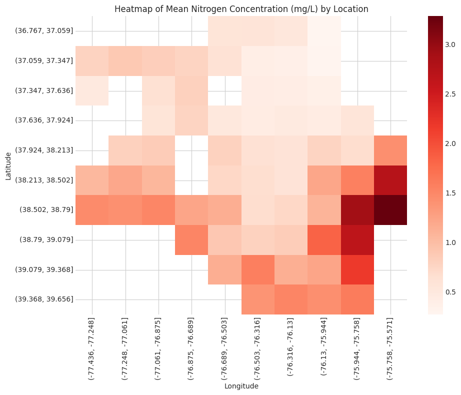
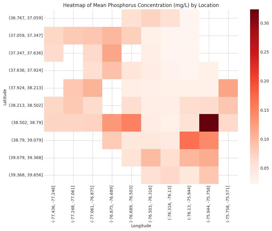
We’ll start by briefly looking at average concentration by location using a heatmap (courtesy of the seaborn library).
Code
# Nitrogen# Bin latitude and longitude into groupsnitr_data_copy = pd.DataFrame(nitr_data)nitr_data_copy['Latitude Group'] = pd.cut(nitr_data['Latitude'], bins=10)nitr_data_copy['Longitude Group'] = pd.cut(nitr_data['Longitude'], bins=10)# Pivot the data to create a heatmapnitr_heatmap_data = nitr_data_copy.pivot_table(index='Latitude Group', columns='Longitude Group', values='MeasureValue', aggfunc='mean')# Remove from environmentdel nitr_data_copy# Initialize the figureplt.figure(figsize=(10, 8))# Set styleplt.style.use('seaborn-whitegrid')# Plot heatmapsns.heatmap(nitr_heatmap_data, cmap='Reds')# Customize the plotplt.title('Heatmap of Mean Nitrogen Concentration (mg/L) by Location')plt.xlabel('Longitude')plt.ylabel('Latitude')plt.tight_layout()plt.show()# Remove from environmentdel nitr_heatmap_data
/tmp/ipykernel_17/2516891936.py:9: FutureWarning: The default value of observed=False is deprecated and will change to observed=True in a future version of pandas. Specify observed=False to silence this warning and retain the current behavior
  nitr_heatmap_data = nitr_data_copy.pivot_table(index='Latitude Group', columns='Longitude Group', values='MeasureValue', aggfunc='mean')
/tmp/ipykernel_17/2516891936.py:18: MatplotlibDeprecationWarning: The seaborn styles shipped by Matplotlib are deprecated since 3.6, as they no longer correspond to the styles shipped by seaborn. However, they will remain available as 'seaborn-v0_8-<style>'. Alternatively, directly use the seaborn API instead.
  plt.style.use('seaborn-whitegrid')
Code
# Phosphorus# Bin latitude and longitude into groupsphos_data_copy = pd.DataFrame(phos_data)phos_data_copy['Latitude Group'] = pd.cut(phos_data['Latitude'], bins=10)phos_data_copy['Longitude Group'] = pd.cut(phos_data['Longitude'], bins=10)# Pivot the data to create a heatmapphos_heatmap_data = phos_data_copy.pivot_table(index='Latitude Group', columns='Longitude Group', values='MeasureValue', aggfunc='mean')# Remove from environmentdel phos_data_copy# Initialize the figureplt.figure(figsize=(10, 8))# Set styleplt.style.use('seaborn-whitegrid')# Plot heatmapsns.heatmap(phos_heatmap_data, cmap='Reds')# Customize the plotplt.title('Heatmap of Mean Phosphorus Concentration (mg/L) by Location')plt.xlabel('Longitude')plt.ylabel('Latitude')plt.tight_layout()plt.show()# Remove from environmentdel phos_heatmap_data
/tmp/ipykernel_17/190755117.py:9: FutureWarning: The default value of observed=False is deprecated and will change to observed=True in a future version of pandas. Specify observed=False to silence this warning and retain the current behavior
  phos_heatmap_data = phos_data_copy.pivot_table(index='Latitude Group', columns='Longitude Group', values='MeasureValue', aggfunc='mean')
/tmp/ipykernel_17/190755117.py:18: MatplotlibDeprecationWarning: The seaborn styles shipped by Matplotlib are deprecated since 3.6, as they no longer correspond to the styles shipped by seaborn. However, they will remain available as 'seaborn-v0_8-<style>'. Alternatively, directly use the seaborn API instead.
  plt.style.use('seaborn-whitegrid')
Interestingly, nitrogen and phosphorus concentration are both generally higher in the southeast regions of the Chesapeake Bay.
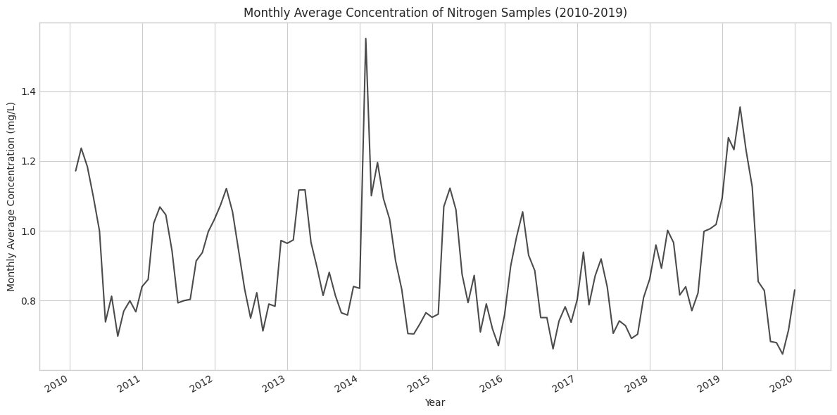
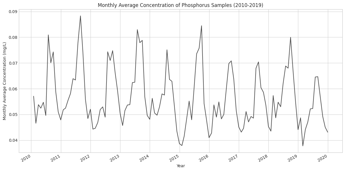
Moving forward, we’ll start with our time series analysis by calculating moving averages for each year-month. We’ll plot these moving averages just to get a general idea of what types of trends we might be looking at.
Code
# Nitrogen# Remove columns from the nitrogen data that are no longer needednitr_data.drop(columns=['Latitude', 'Longitude'], inplace=True)# Set 'SampleDate' as the indexnitr_data.set_index('SampleDate', inplace=True)# Resample to monthly frequency and calculate the mean for the 'MeasureValue' columnnitr_monthly_avg = nitr_data['MeasureValue'].resample('M').mean()# Convert the result to a DataFrame, but keep the datetime indexnitr_monthly_avg = nitr_monthly_avg.to_frame()# Remove from environmentdel nitr_data# Initialize figureplt.figure(figsize=(12, 6))# Plot monthly average nitrogen dataplt.plot(nitr_monthly_avg.index, nitr_monthly_avg['MeasureValue'], color='black', alpha=0.7)# Customize the plotplt.title('Monthly Average Concentration of Nitrogen Samples (2010-2019)')plt.xlabel('Year')plt.ylabel('Monthly Average Concentration (mg/L)')# Rotate and align tick labelsplt.gcf().autofmt_xdate()# Use tight layout to ensure everything fits without overlappingplt.tight_layout()plt.show()
/tmp/ipykernel_17/3811197196.py:10: FutureWarning: 'M' is deprecated and will be removed in a future version, please use 'ME' instead.
  nitr_monthly_avg = nitr_data['MeasureValue'].resample('M').mean()
From this plot, there does appear to be seasonality for nitrogen concentrations, but there is no clear trend component. In addition, there is a notable spike in early 2014.
Code
# Phosphorus# Remove columns from the nitrogen data that are no longer neededphos_data.drop(columns=['Latitude', 'Longitude'], inplace=True)# Set 'SampleDate' as the indexphos_data.set_index('SampleDate', inplace=True)# Resample to monthly frequency and calculate the mean for the 'MeasureValue' columnphos_monthly_avg = phos_data['MeasureValue'].resample('M').mean()# Convert the result to a DataFrame, but keep the datetime indexphos_monthly_avg = phos_monthly_avg.to_frame()# Remove from environmentdel phos_data# Initialize figureplt.figure(figsize=(12, 6))# Plot monthly average phosphorus dataplt.plot(phos_monthly_avg.index, phos_monthly_avg['MeasureValue'], color='black', alpha=0.7)# Customize the plotplt.title('Monthly Average Concentration of Phosphorus Samples (2010-2019)')plt.xlabel('Year')plt.ylabel('Monthly Average Concentration (mg/L)')# Rotate and align tick labelsplt.gcf().autofmt_xdate()# Use tight layout to ensure everything fits without overlappingplt.tight_layout()plt.show()
/tmp/ipykernel_17/729465269.py:10: FutureWarning: 'M' is deprecated and will be removed in a future version, please use 'ME' instead.
  phos_monthly_avg = phos_data['MeasureValue'].resample('M').mean()
Similar to the nitrogen plot, phosphorus also seems to exhibit a distinct seasonal component. Again, it is unclear whether there is an underlying trend.
Methods
Autocorrelation Function
The autocorrelation function calculates the correlation between the dependent variable at a given point in time and various time lags for this same variable. Thus, the autocorrelation function provides us with a tool that allows us to better understand any seasonality present in our data. This will be useful for us in subsequent steps of our time series analysis.
STL Decomposition
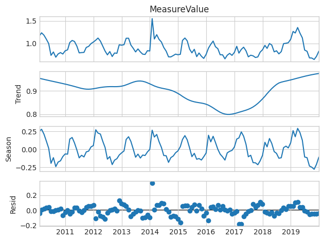
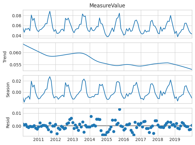
As a core part of this time series analysis, I’ll be constructing a seasonal trend decomposition using locally estimated scatterplot smoothing (LOESS), which is often abbreviated as a STL decomposition model. STL allows us to separate our monthly average concentrations into three components: seasonal component, trend component, and residual component. Through plotting these components next to each other, we gain a more intuitive understanding of the underlying forces contributing to variation in our dependent variable, which in this case is the monthly average concentration.
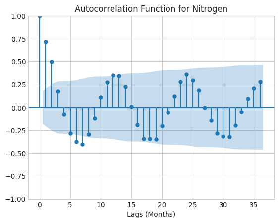
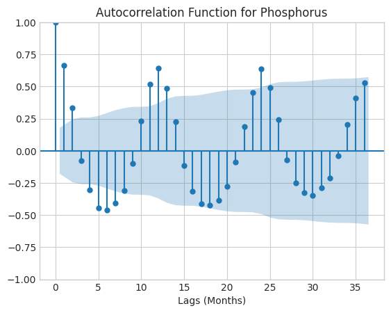
As opposed to other decomposition methods, one thing that is particular to STL models is the ability to specify the length of a season. It can be helpful to adjust this input depending on our desired level of smoothing for the trend component. We will use our results from the autocorrelation function to inform our chosen length of seasons. The autocorrelation function is useful in this context because it can tell us after how many lags we see a drop-off in autocorrelation, indicating there is a drop in the significance of the seasonal component.
Results
Autocorrelation Function
Code
# Nitrogen# Plot autocorrelation function for nitrogen with lags going back three yearssm.graphics.tsa.plot_acf(nitr_monthly_avg['MeasureValue'], lags=36, alpha=0.05)plt.xlabel('Lags (Months)')plt.title('Autocorrelation Function for Nitrogen')plt.show()
Code
# Phosphorus# Plot autocorrelation function for phosphorus with lags going back three yearssm.graphics.tsa.plot_acf(phos_monthly_avg['MeasureValue'], lags=36)plt.xlabel('Lags (Months)')plt.title('Autocorrelation Function for Phosphorus')plt.show()
For both autocorrelation functions, there is a drop-off in autocorrelation after the t-24 lag, so I will choose 24 months as constituting one seasonal period when constructing my model in the next step.
STL Decomposition
Code
# Nitrogen# Perform STL decomposition# Select trend parameter that is about halfway into the second season-periodnitr_stl = STL(nitr_monthly_avg['MeasureValue'], period=24, trend=35)nitr_decomp = nitr_stl.fit()nitr_decomp.plot()# Remove from environmentdel nitr_stl
In this plot of the three STL components for nitrogen, it is still difficult to see a long-term trend, despite the line being fairly smooth. There does seem to be a slight downward trend until 2018. However, starting in 2018, there is a clear increase for the rest of the time series.
Code
# Phosphorus# Perform STL decomposition# Select trend parameter that is about halfway into the second season-periodphos_stl = STL(phos_monthly_avg['MeasureValue'], period=24, trend=35)phos_decomp = phos_stl.fit()phos_decomp.plot()# Remove from environmentdel phos_stl
The STL plot for phosphorus does make it seem like there is a long-term downward trend, but it is difficult to tell how significant it is compared to the other components.The STL plot for phosphorus does make it seem like there is a long-term downward trend, but it is difficult to tell how significant it is because of the long grey bar, which indicates it is least influential of the three components in our STL model.
Code
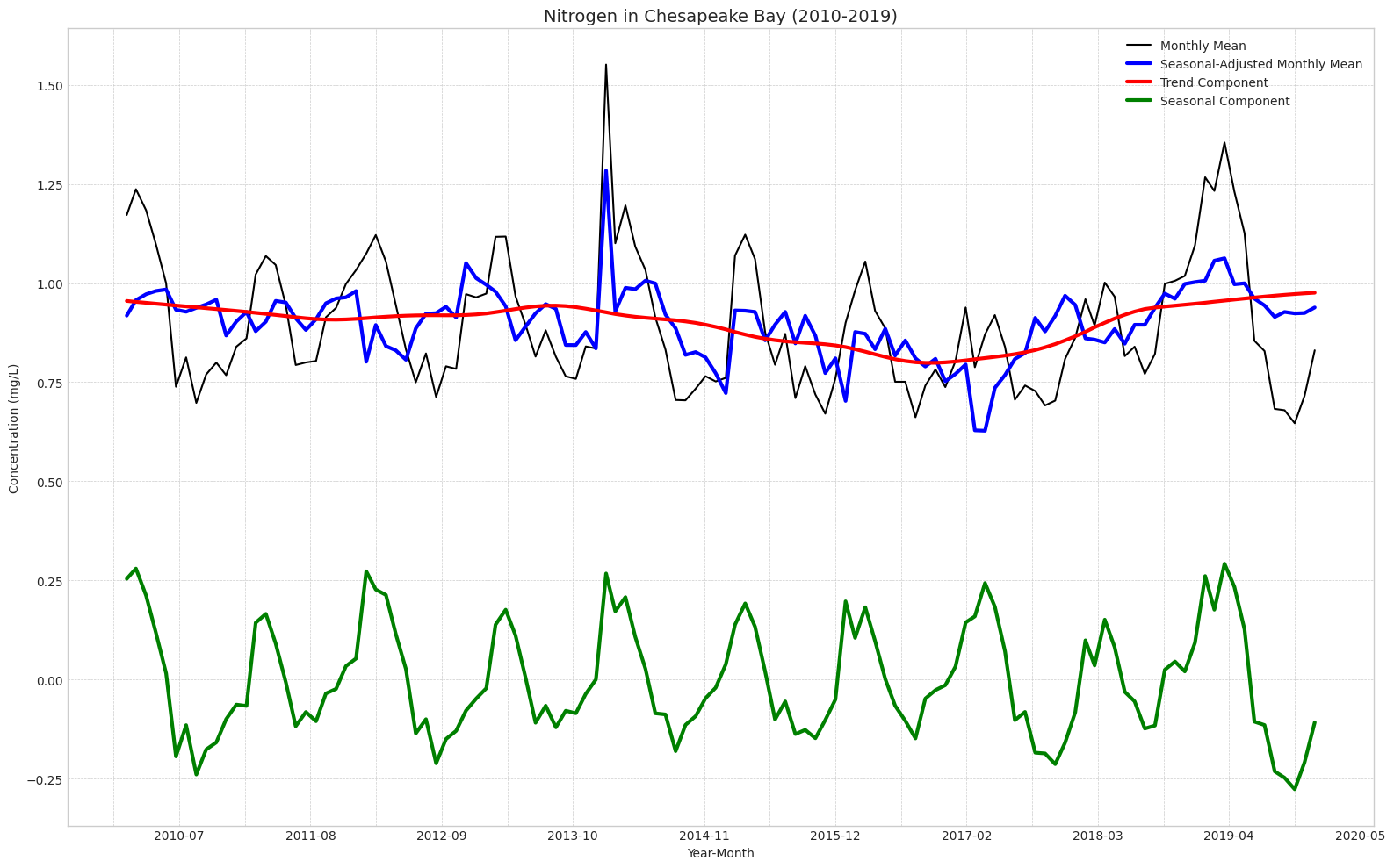
# Nitrogen# Extract the componentsnitr_trend = nitr_decomp.trendnitr_seasonal = nitr_decomp.seasonalnitr_resid = nitr_decomp.resid# Remove from environmentdel nitr_decomp# Calculate the seasonally adjusted seriesnitr_seasonally_adjusted = nitr_monthly_avg['MeasureValue'].values - nitr_seasonal# Create the plotplt.figure(figsize=(16, 10))# Plot all components on the same axisplt.plot(nitr_monthly_avg.index, nitr_monthly_avg['MeasureValue'].values, label='Monthly Mean', color='black')plt.plot(nitr_monthly_avg.index, nitr_seasonally_adjusted, label='Seasonal-Adjusted Monthly Mean', color='blue', linewidth=3)plt.plot(nitr_monthly_avg.index, nitr_trend, label='Trend Component', color='red', linewidth=3)plt.plot(nitr_monthly_avg.index, nitr_seasonal, label='Seasonal Component', color='green', linewidth=3)# Customize x-axis for date breaksplt.gca().xaxis.set_major_locator(plt.MaxNLocator(10)) # Yearly major ticksplt.gca().xaxis.set_minor_locator(plt.MaxNLocator(20)) # Half-yearly minor ticksplt.gca().xaxis.set_major_formatter(plt.matplotlib.dates.DateFormatter('%Y-%m'))# Set labels and titleplt.xlabel('Year-Month')plt.ylabel('Concentration (mg/L)')plt.title('Nitrogen in Chesapeake Bay (2010-2019)', fontsize=14)# Customize legendplt.legend(loc='upper right')# Add a grid and themeplt.grid(True, which='both', linestyle='--', linewidth=0.5)plt.tight_layout()# Show the plotplt.show()# Remove from environmentdel nitr_seasonally_adjusted
I decided to make this visualization to get a better idea of exactly how these components map on to each other. This plot seems to confirm the idea of negligible trend component for nitrogen. Since the x-axis is labeled for each year here, it is also easier to see the seasonality. Each year, nitrogen concentrations increase sharply around December. They then peak around February to March, before decreasing substantially and reaching their minimum around July.
Code
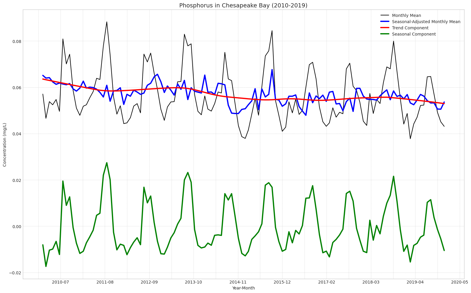
# Phosphorus# Extract the componentsphos_trend = phos_decomp.trendphos_seasonal = phos_decomp.seasonalphos_resid = phos_decomp.resid# Remove from environmentdel phos_decomp# Calculate the seasonally adjusted seriesphos_seasonally_adjusted = phos_monthly_avg['MeasureValue'].values - phos_seasonal# Create the plotplt.figure(figsize=(16, 10))# Plot all components on the same axisplt.plot(phos_monthly_avg.index, phos_monthly_avg['MeasureValue'].values, label='Monthly Mean', color='black')plt.plot(nitr_monthly_avg.index, phos_seasonally_adjusted, label='Seasonal-Adjusted Monthly Mean', color='blue', linewidth=3)plt.plot(phos_monthly_avg.index, phos_trend, label='Trend Component', color='red', linewidth=3)plt.plot(phos_monthly_avg.index, phos_seasonal, label='Seasonal Component', color='green', linewidth=3)# Customize x-axis for date breaksplt.gca().xaxis.set_major_locator(plt.MaxNLocator(10)) # Yearly major ticksplt.gca().xaxis.set_minor_locator(plt.MaxNLocator(20)) # Half-yearly minor ticksplt.gca().xaxis.set_major_formatter(plt.matplotlib.dates.DateFormatter('%Y-%m'))# Set labels and titleplt.xlabel('Year-Month')plt.ylabel('Concentration (mg/L)')plt.title('Phosphorus in Chesapeake Bay (2010-2019)', fontsize=14)# Customize legendplt.legend(loc='upper right')# Add a grid and themeplt.grid(True, which='both', linestyle='--', linewidth=0.5)plt.tight_layout()# Show the plotplt.show()# Remove from environmentdel phos_seasonally_adjusted
Our plot for phosphorus further supports the idea that there is a slight downward trend over the decade. If you independently trace the maximums or minimums, the line does seem to be moving downward at an oscillating but fairly consistent rate. Unlike nitrogen, phosphorus concentrations shoot up in the middle of the year around May, have a relatively flat peak lasting from June to August, and then shoot down at the end of Summer.
Linear Regressions of Model Parameters
Code
# Nitrogen# Run regression of season component on monthly averageX = sm.add_constant(nitr_seasonal)y = nitr_monthly_avg['MeasureValue'].valuesnitr_season_reg = OLS(y, X).fit()# Print R-squaredr_squared = nitr_season_reg.rsquaredprint(f"R-squared: {r_squared:.3f}")
R-squared: 0.725
The adjusted R-squared of 0.73 indicates that seasonality explains about 73% of the variation in nitrogen monthly mean.
Code
# Phosphorus# Run regression of season component on monthly averageX = sm.add_constant(phos_seasonal)y = phos_monthly_avg['MeasureValue'].valuesphos_season_reg = OLS(y, X).fit()# Print R-squaredr_squared = phos_season_reg.rsquaredprint(f"R-squared: {r_squared:.3f}")
R-squared: 0.867
For phosphorus, the adjusted R-squared of this regression is 0.87, confirming our idea that seasonality is more pronounced with phosphorus.
Code
# Nitrogen# Calculate months since startstart_date = nitr_monthly_avg.index[0]nitr_monthly_avg['months_since_start'] = (nitr_monthly_avg.index.year - start_date.year) *12+ (nitr_monthly_avg.index.month - start_date.month)# Run regression of trend component on days since startX = sm.add_constant(nitr_monthly_avg['months_since_start'])y = nitr_trendnitr_season_reg = OLS(y, X).fit()# Print the regression summaryprint(nitr_season_reg.summary())# Get the coefficient (slope)monthly_trend_estimate = nitr_season_reg.params['months_since_start']# Get the standard error of the coefficientse = nitr_season_reg.bse['months_since_start']# Calculate the t-statistic for 95% confidence interval# Degrees of freedom: n - k - 1, where n is number of observations and k is number of predictorsdf = nitr_season_reg.df_residt_value = stats.t.ppf(0.975, df) # 0.975 for two-tailed 95% CI# Calculate estimate for 10-year aggregated trend componentfullseries_trend_estimate =120* monthly_trend_estimate# Calculate the confidence interval for 10 year change (120 * monthly trend component)ci_lower =120* (monthly_trend_estimate - t_value * se)ci_upper =120* (monthly_trend_estimate + t_value * se)# Print resultsprint(f"Estimated 10-year trend component (mg/L):\n{fullseries_trend_estimate:.3f}")print(f"95% Confidence Interval for 10-year trend component (mg/L):\n({ci_lower:.3f}, {ci_upper:.3f})")# Calculate estimate for 10-year aggregated trend component (as percent of January 2010)fullseries_trend_estimate_aspercent = fullseries_trend_estimate / nitr_trend.values[0]# Calculate the confidence interval for 10 year change (120 * monthly trend component) as percent of January 2010ci_lower = ci_lower / nitr_trend.values[0]ci_upper = ci_upper / nitr_trend.values[0]# Print resultsprint(f"Estimated 10-year trend component (as percent of January 2010):\n{fullseries_trend_estimate_aspercent:.3f}")print(f"95% Confidence Interval for 10-year trend component (as percent of January 2010):\n({ci_lower:.3f}, {ci_upper:.3f})")# Remove from environmentdel nitr_monthly_avgdel nitr_trend
In this linear regression, we look at the influence of year-month on our trend component for nitrogen. The regression output tells us that we can say at an alpha equals 0.05 significance level that the 10-year trend component was negative. Furthermore, the first interval tells us that there is a 95% chance that the interval from -0.067 mg/L to -0.006 mg/L contains the true 10-year trend component. The second interval shows that this represents a -0.071% to -0.007% change as compared to the trend component in January 2010.
Code
# Phosphorus# Calculate months since startstart_date = phos_monthly_avg.index[0]phos_monthly_avg['months_since_start'] = (phos_monthly_avg.index.year - start_date.year) *12+ (phos_monthly_avg.index.month - start_date.month)# Run regression of trend component on days since startX = sm.add_constant(phos_monthly_avg['months_since_start'])y = phos_trendphos_season_reg = OLS(y, X).fit()# Print the regression summaryprint(phos_season_reg.summary())# Get the coefficient (slope)monthly_trend_estimate = phos_season_reg.params['months_since_start']# Get the standard error of the coefficientse = phos_season_reg.bse['months_since_start']# Calculate the t-statistic for 95% confidence interval# Degrees of freedom: n - k - 1, where n is number of observations and k is number of predictorsdf = phos_season_reg.df_residt_value = stats.t.ppf(0.975, df) # 0.975 for two-tailed 95% CI# Calculate estimate for 10-year aggregated trend componentfullseries_trend_estimate =120* monthly_trend_estimate# Calculate the confidence interval for 10 year change (120 * monthly trend component)ci_lower =120* (monthly_trend_estimate - t_value * se)ci_upper =120* (monthly_trend_estimate + t_value * se)# Print resultsprint(f"Estimated 10-year trend component (mg/L):\n{fullseries_trend_estimate:.5f}")print(f"95% Confidence Interval for 10-year trend component (mg/L):\n({ci_lower:.5f}, {ci_upper:.5f})")# Calculate estimate for 10-year aggregated trend component (as percent of January 2010)fullseries_trend_estimate_aspercent = fullseries_trend_estimate / phos_trend.values[0]# Calculate the confidence interval for 10 year change (120 * monthly trend component) as percent of January 2010ci_lower = ci_lower / phos_trend.values[0]ci_upper = ci_upper / phos_trend.values[0]# Print resultsprint(f"Estimated 10-year trend component (as percent of January 2010):\n{fullseries_trend_estimate_aspercent:.3f}")print(f"95% Confidence Interval for 10-year trend component (as percent of January 2010):\n({ci_lower:.3f}, {ci_upper:.3f})")
For phosphorus, the linear regression output tells us that we are confident at the alpha equals 0.05 level that the 10-year trend component was negative. Specifically, we find that there is a 95% chance that the interval between -0.0087 mg/L and -0.0073 mg/L contains the true 10-year trend component. This represents a -0.14% to -0.12% change as compared to the trend component in January 2010.
Conclusion
My time series analysis suggests that seasonality plays a substantial role in contributing to variation in the monthly mean concentration of nitrogen and phosphorus in tidal regions of the Chesapeake Bay. For nitrogen, seasonal trends explained 73% of the variation in monthly means, and the relationship was even stronger for phosphorus, with seasonal trends explaining 87% of the variation. While the seasonal component for nitrogen was highest during Winter, the seasonal component for phosphorus was highest during Summer.
This analysis was also interested in any non-seasonal trend that has occurred since the introduction of TMDL requirements in 2010. For both nitrogen and phosphorus, we find evidence at an alpha level of 0.05 that the 10-year trend component was negative. However, our confidence intervals suggest that, for both nutrient pollutants, these changes in trend represent a less than 0.2% decrease over the 10-year time series.
The main limitation of this analysis was that no form of spatial interpolation was employed to estimate concentrations across the tidal region based on the location of measurements. It would be interesting to compare such an analysis to what we did here, as any significant differences would imply that sampled areas are not spread throughout the region in a representative manner. Further analysis might also investigate what happened at the beginning of 2014 that could have led to the high spike in nitrogen levels at that time, in addition to factors that might have fueled the increase seen over the course of 2018.
Citation
BibTeX citation:
@online{ghanadan2024,
  author = {Ghanadan, Linus},
  title = {Time {Series} {Analysis} of {Nutrient} {Concentration} in
    {Chesapeake} {Bay}},
  date = {2024-01-20},
  url = {https://linusghanadan.github.io/blog/2024-8-20-post/chesapeake-bay-python.html},
  langid = {en}
}